金獎
第四屆AHLA亞洲人居景觀獎金獎-漕河涇印象城
項目名稱 | Name :深圳萬科長湖頭啟城示范區
項目面積 | Area :4300㎡
委托業主 | Client :深圳萬科
項目地點 | Location :深圳長湖頭
01.項目背景 | PROJECT BACKGROUND
▼規劃背景 | Planning Background
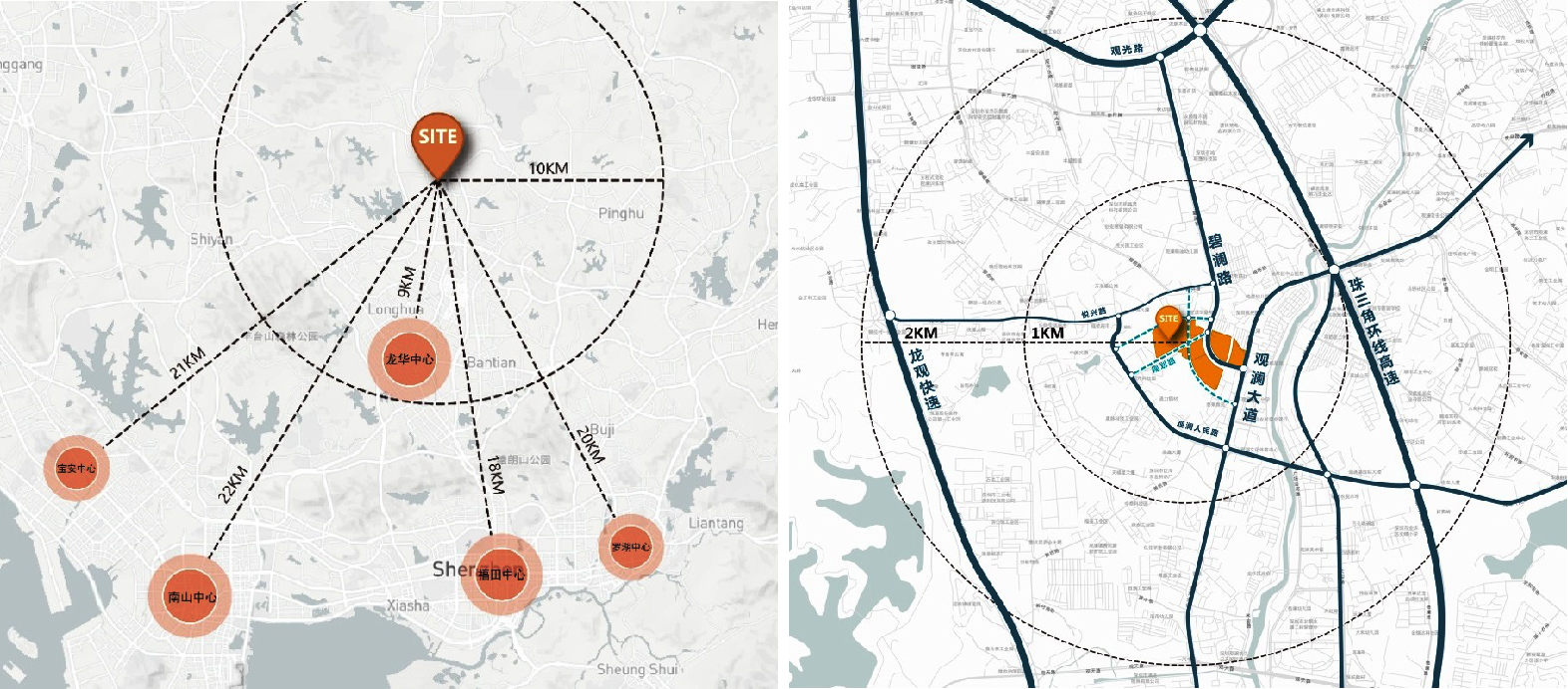
本項目位于灣區中軸龍華區近地鐵4號線長湖站,周邊1KM范圍享商圈、醫療、生態等豐富資源。項目為城市綜合體,匯聚高端住宅、街區商業復合業態,將打造
新一代城市街區生活示范樣板。
The project is located in the Fuhuan District, Longhua District, the central axis of the Bay Area, near the Changhu Station of Metro Line 4, and enjoys rich resources such as
business circle, medical treatment and ecology within a radius of 1KM. The project is an urban complex, which gathers high-end residential and block commercial complex
business forms, and will create a new generation of urban street life demonstration model.
▼項目現狀 | Project Status
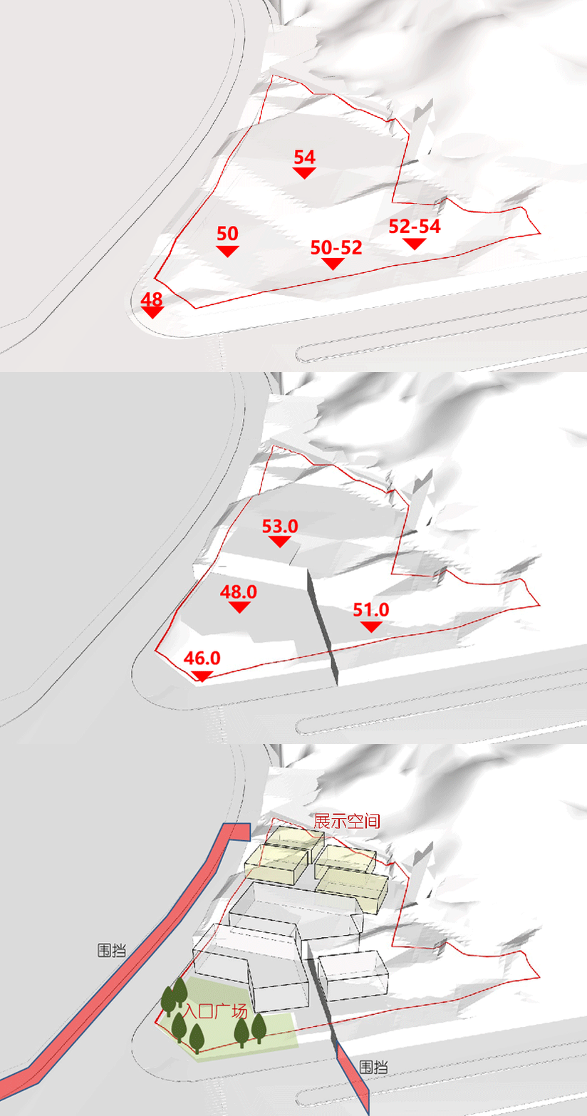
展示區開放時周邊還是工地環境,無城市展示界面且基地地形存在7米左右高差。因此在設計手法中因地制宜,順應場地高差,以“階梯”的設計手法,層層上升,
退讓入口前廣場,并在場地周邊合理規劃展示圍擋范圍,與周邊環境隔開。
When the exhibition area is open, the surrounding area is still a construction site environment, there is no urban display interface and the terrain of the base has a height
difference of about 7 meters. Therefore, the design method should be adapted to local conditions and the height difference of the site. With the "ladder" design method,
the site rises layer by layer, retreats to the square in front of the entrance, and reasonably plans and displays the fenced area around the site to separate it from the surro-
unding environment.
02.設計定位 | DESIGN POSITIONING
▼靈感追溯 | Inspiration
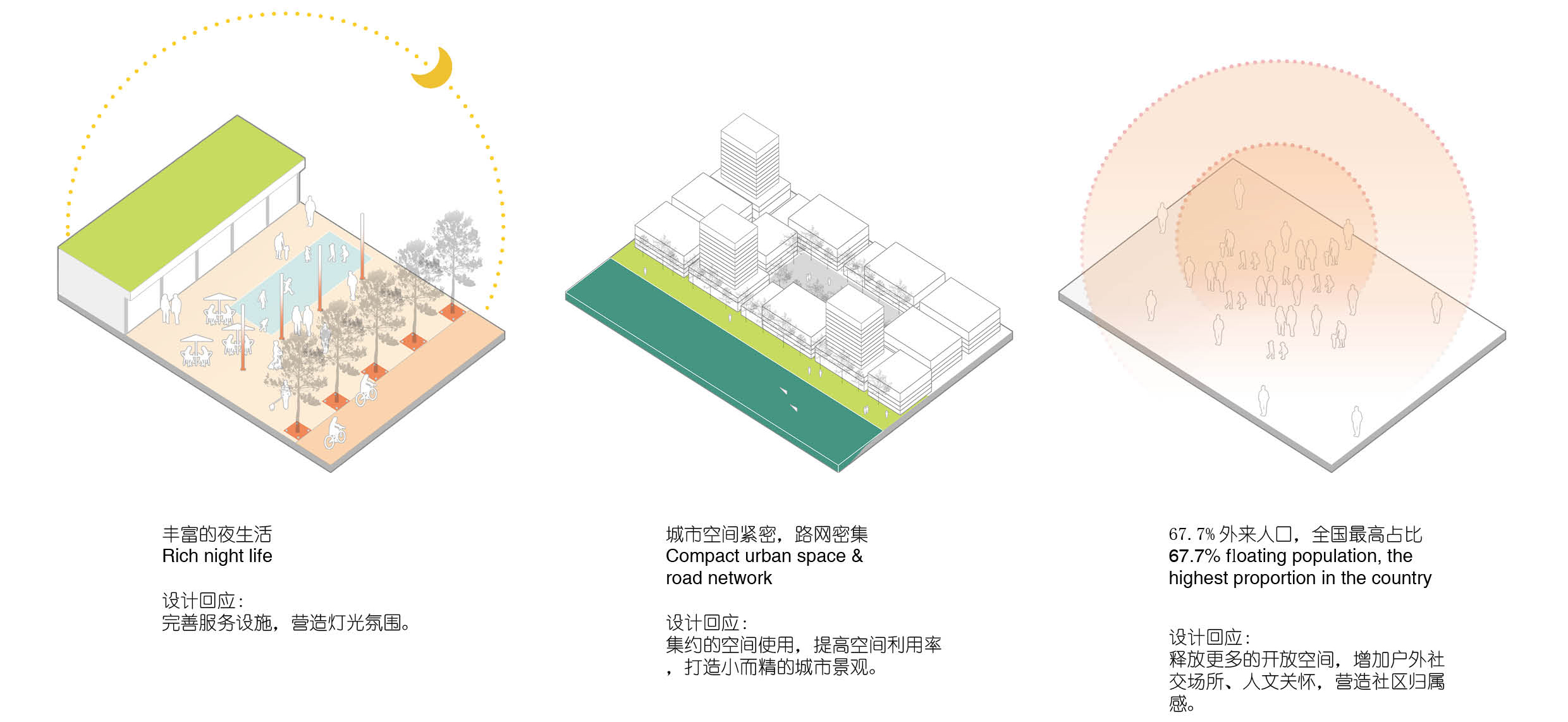
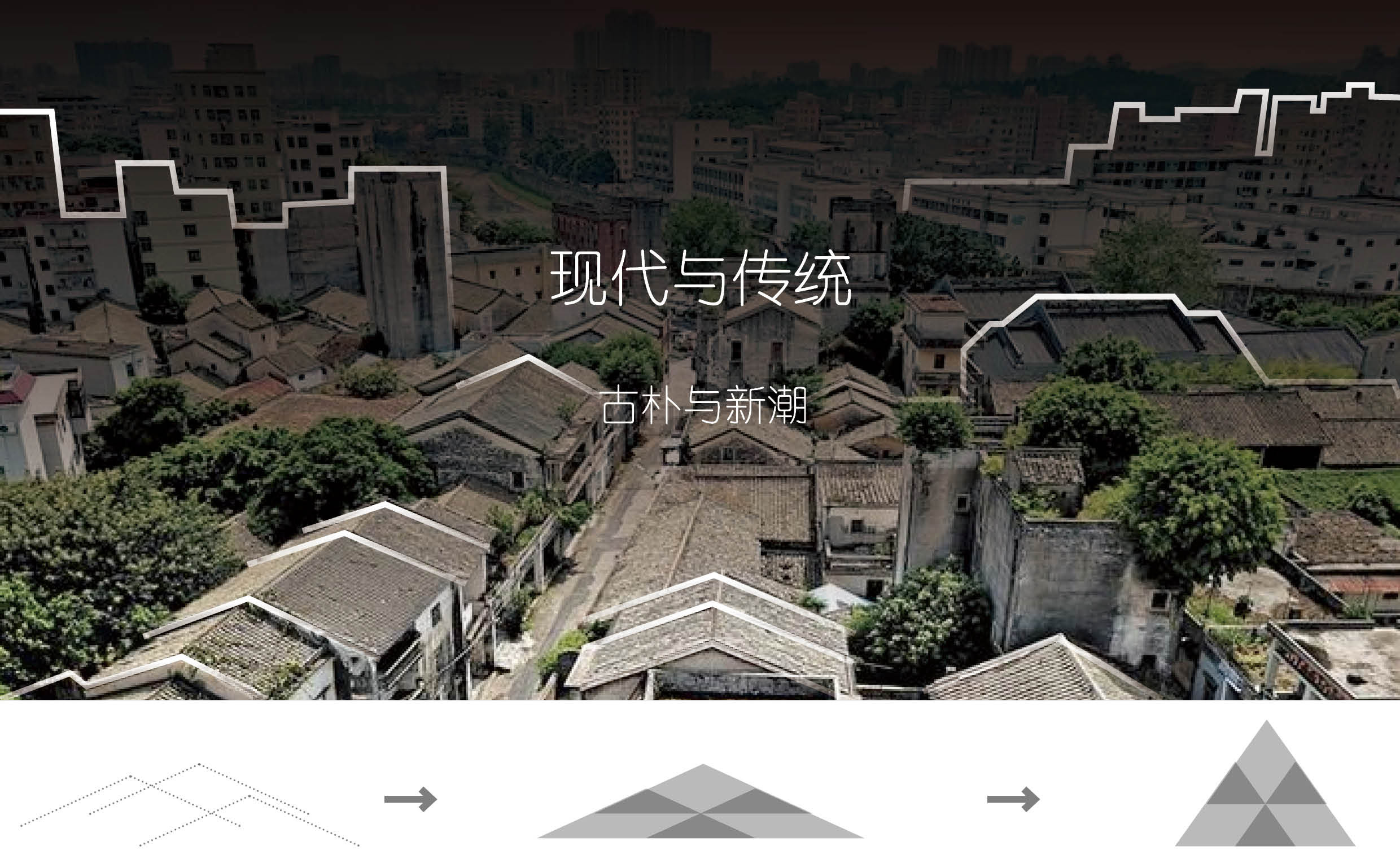
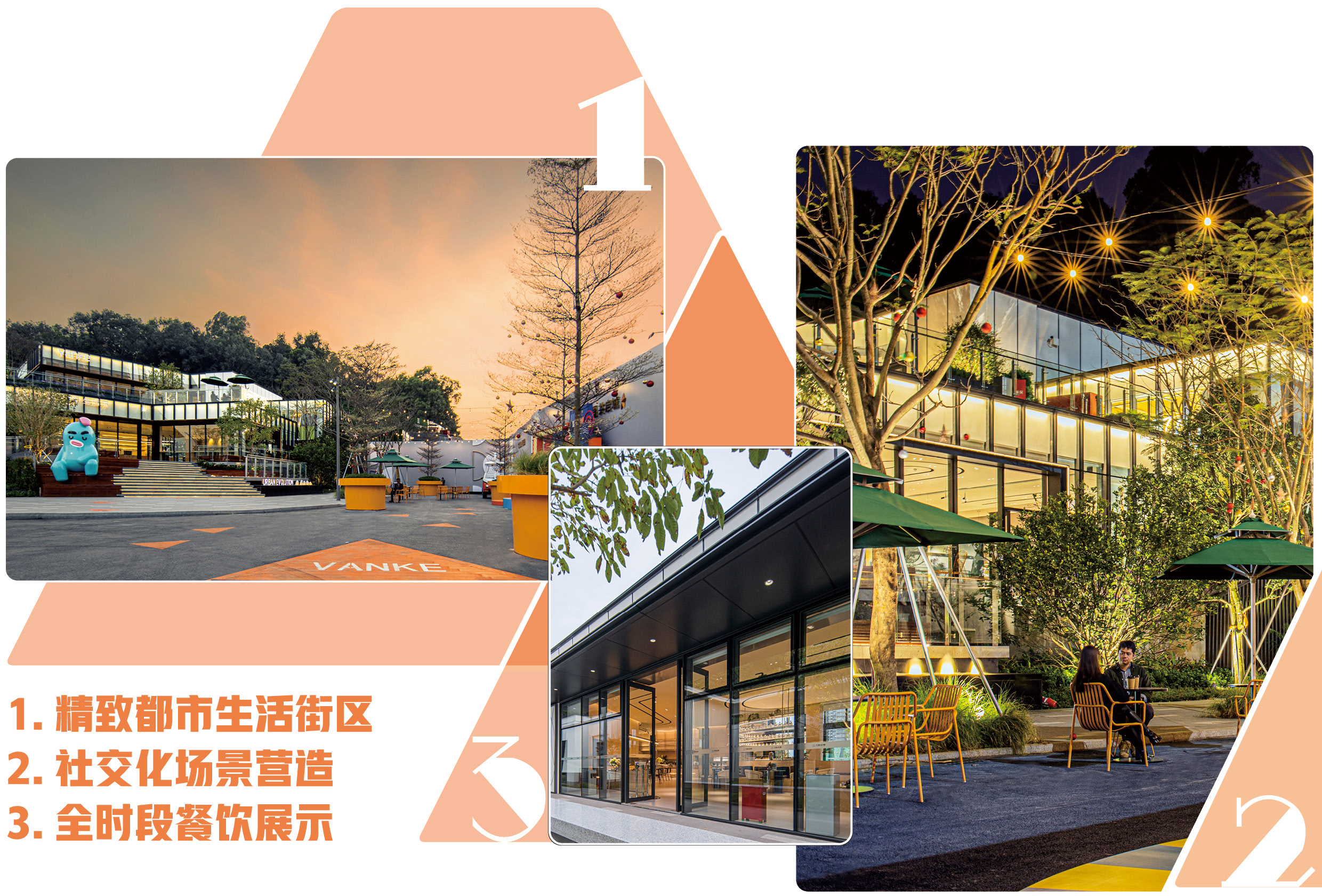
結合當地建筑文化特色以及人文生活習性,提取景觀元素予以設計回應。
Combined with local architectural cultural characteristics and human life habits, landscape elements are extracted for design response.
▼景觀愿景 | Landscape Vision
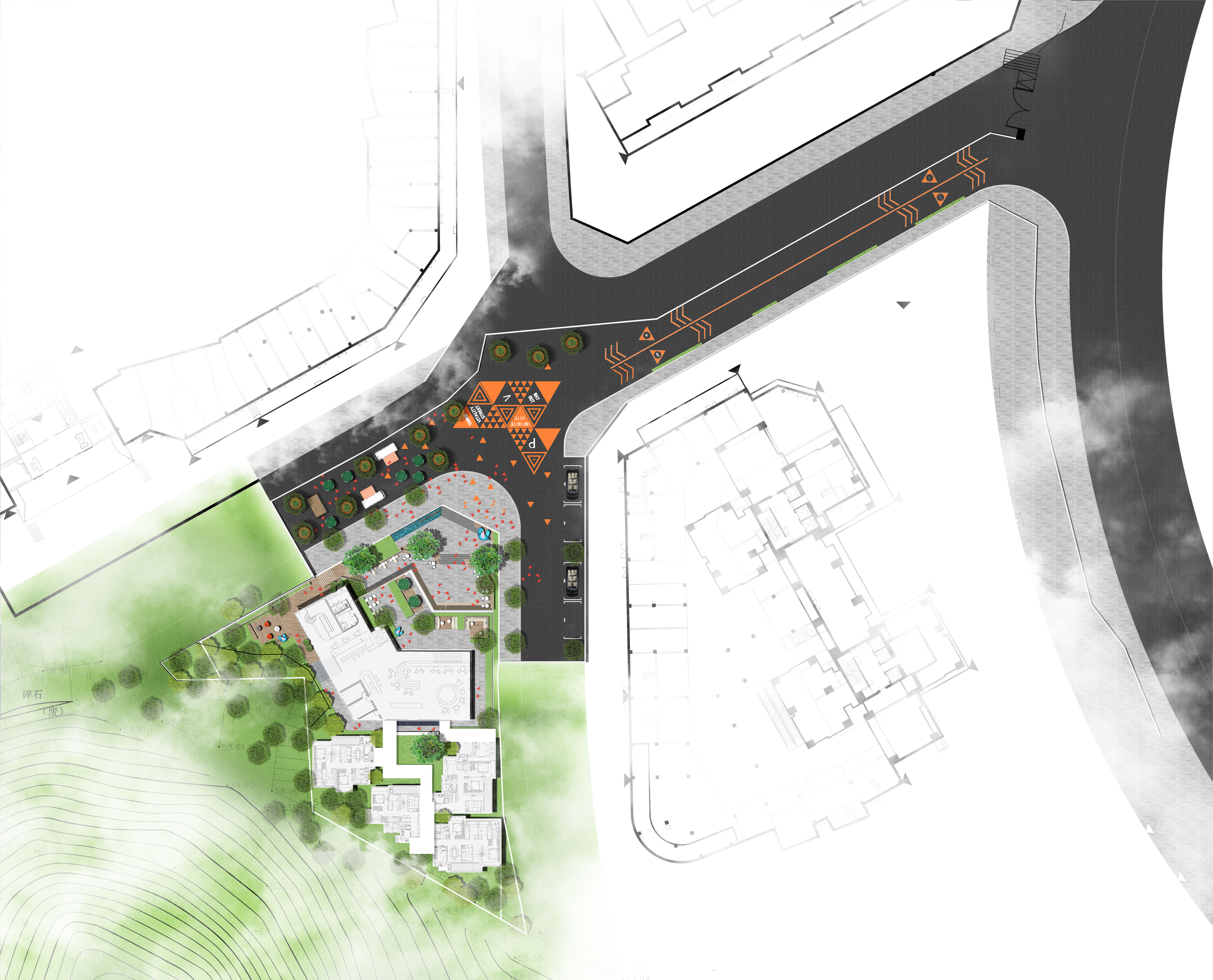
▼總平面圖 | Masterplan
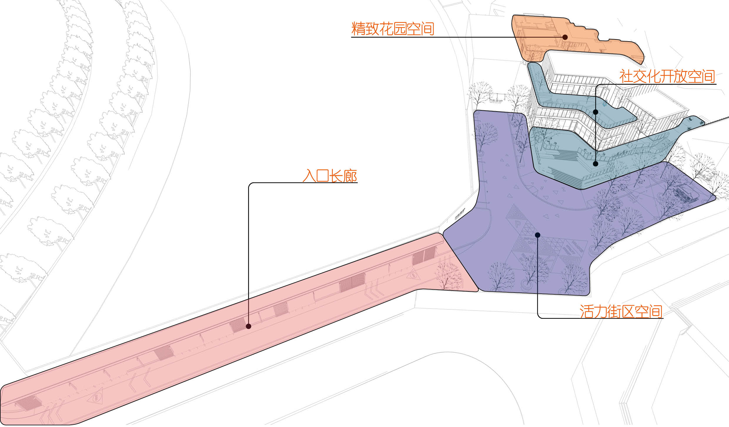
▼功能分區 | Functional Partition
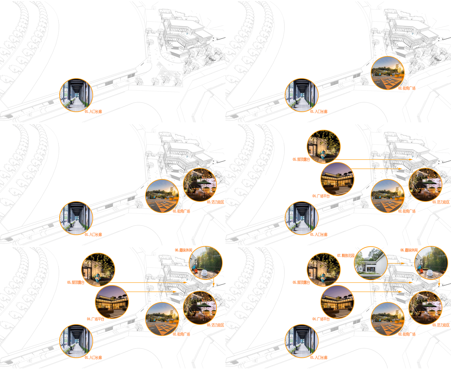
▼入口安全長廊 | ENTRANCE PROMENADE
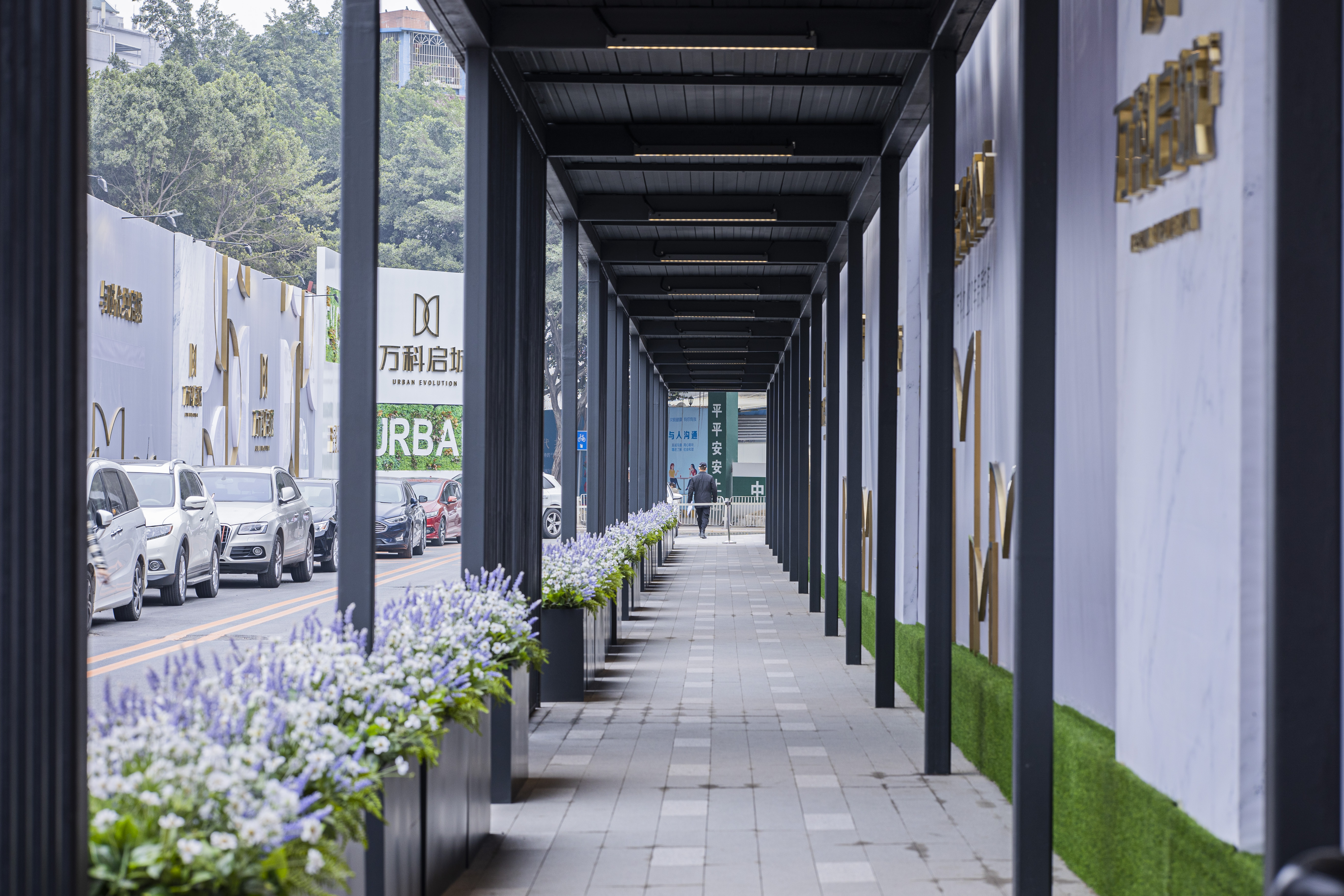
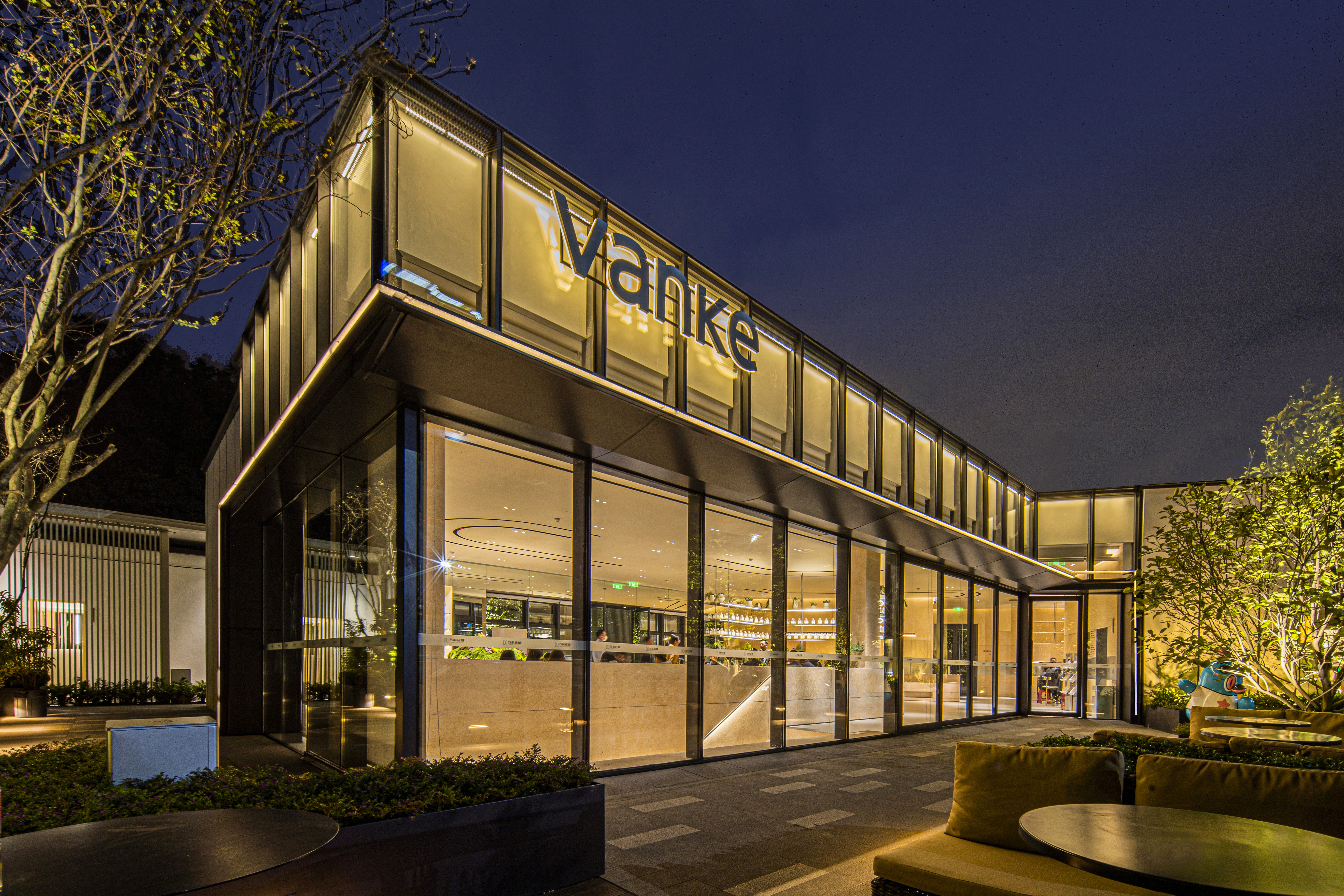
人行通道入口至銷售中心入口步行距離約103米,因此在設計中利用場地現場條件,橫向打造項目的視覺界面,再通過格柵和花箱引導人流和視線,形成行為界面。
The walking distance between the entrance of the pedestrian passageway and the entrance of the entry corridor sales center is about 103 meters. Therefore, the design utili-
zes the site conditions to create the visual interface of the project horizontally, and then guides the people and sight through the grille and flower box to form the behavior-
al interface.
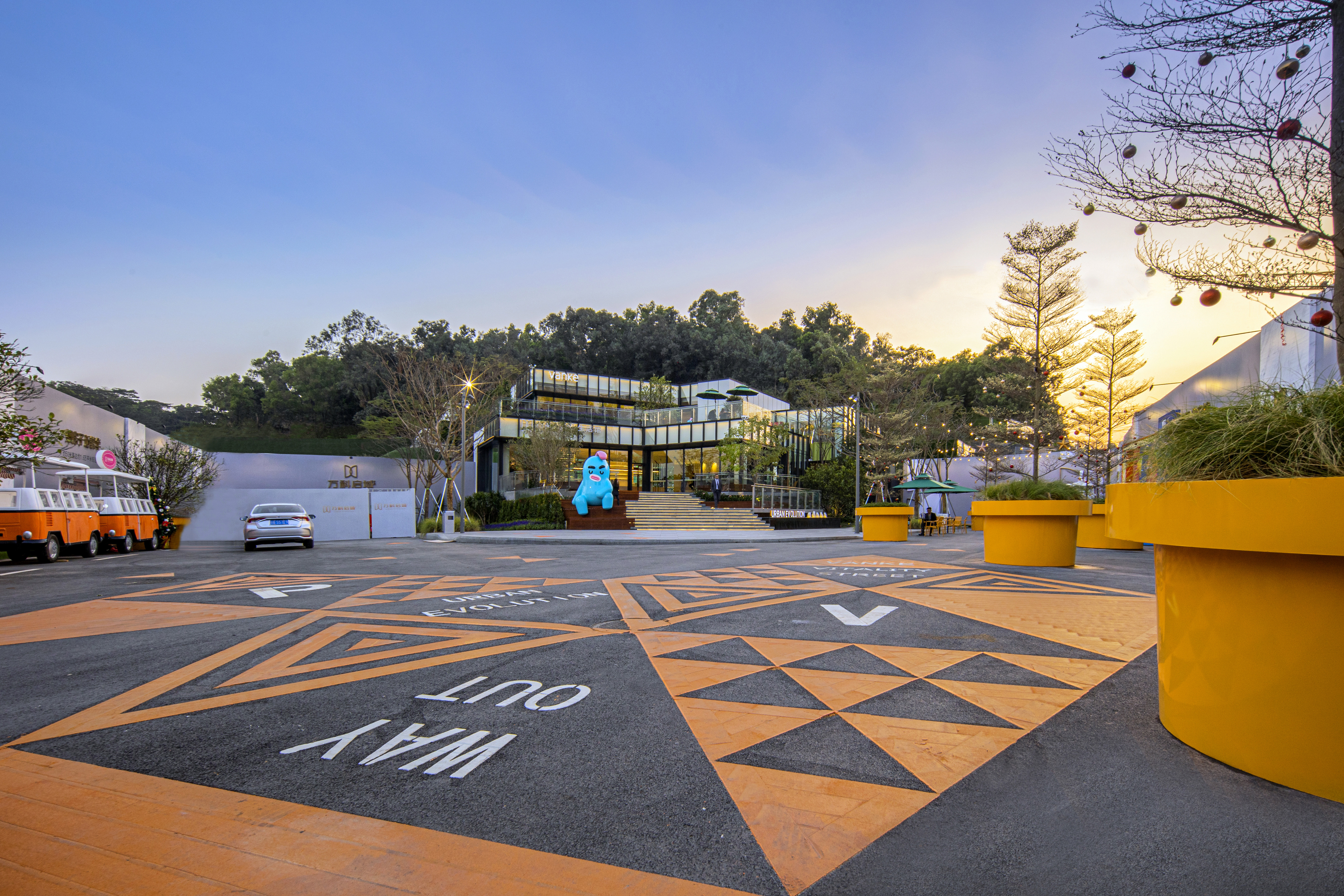
▼街角廣場 | Corner Square
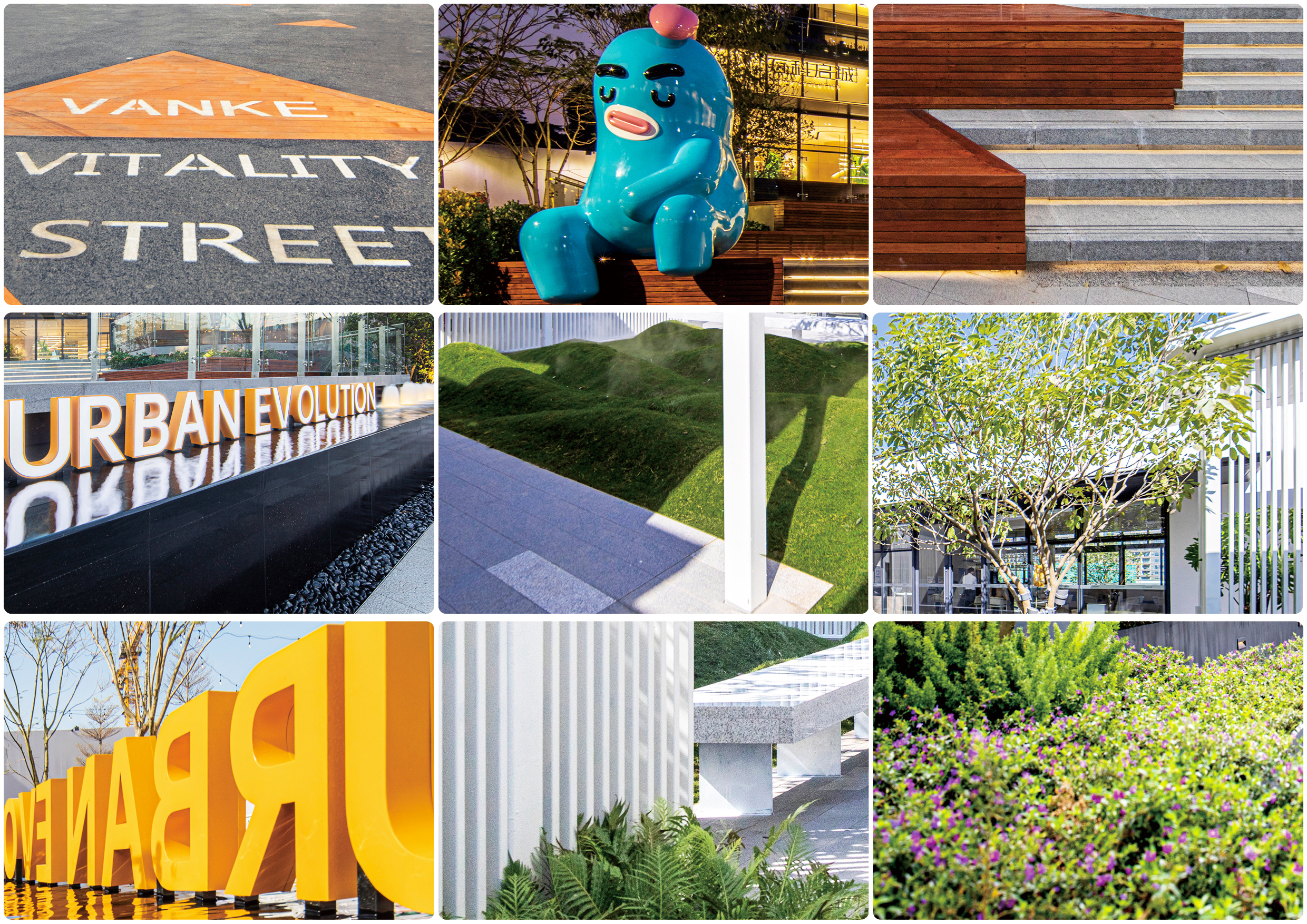
運用設計符號的演變圖案、亮眼的色調,呈現在地面,時尚又具有視覺引導性同時提升街區的活躍氣質。
The evolution patterns of design symbols and bright colors are presented on the ground, which is fashionable and visually instructive while enhancing the active temperament
of the steetscape.
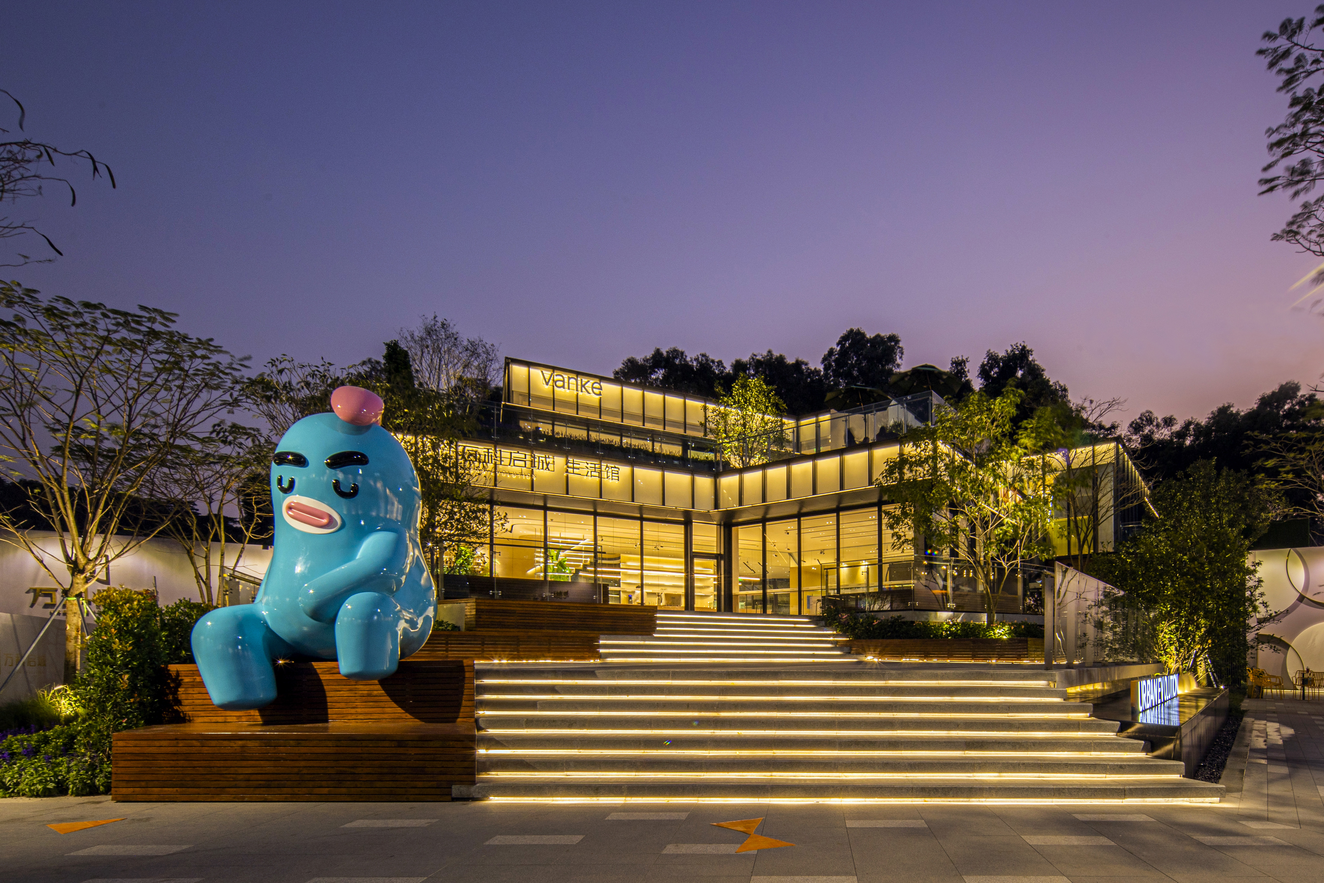
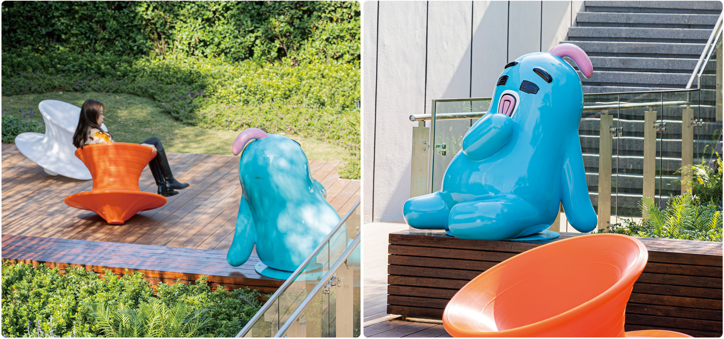
場地中選用極具代表性的IP形象,參與到場景中,極具昭示性及活力。
A representative IP image is selected in the site to participate in the scene, which is very clear and energetic.
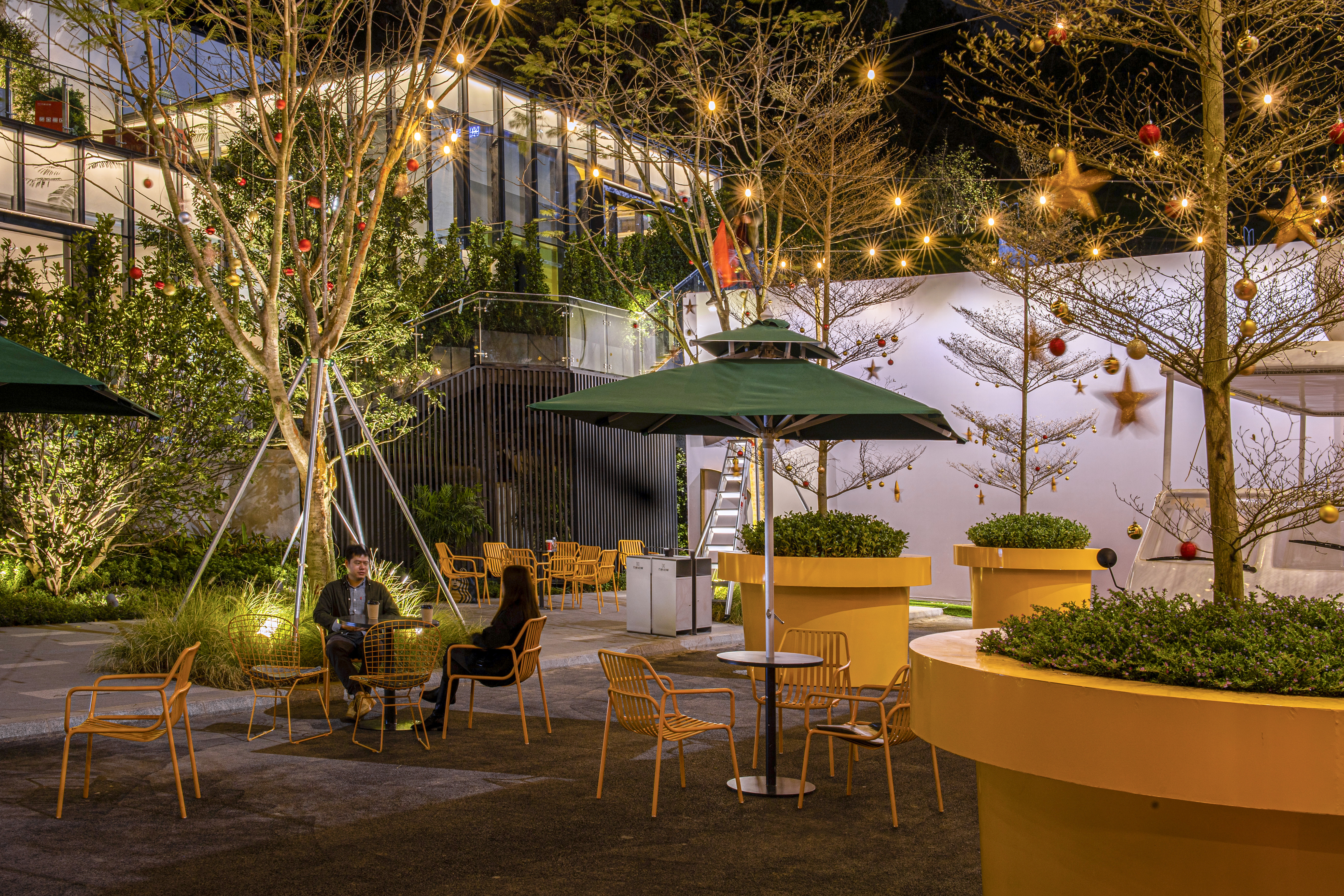
▼街區市集 | Street Market
集市場景的呈現,結合餐飲外擺與懸掛燈等等,體現了街區商業氛圍,給予未來生活街區美好的期待與想象。
The presentation of the market scene, combined with the restaurant spill-out and hanging lights, reflects the commercial atmosphere of the street and gives a better expecta-
tion and imagination to the future living street.
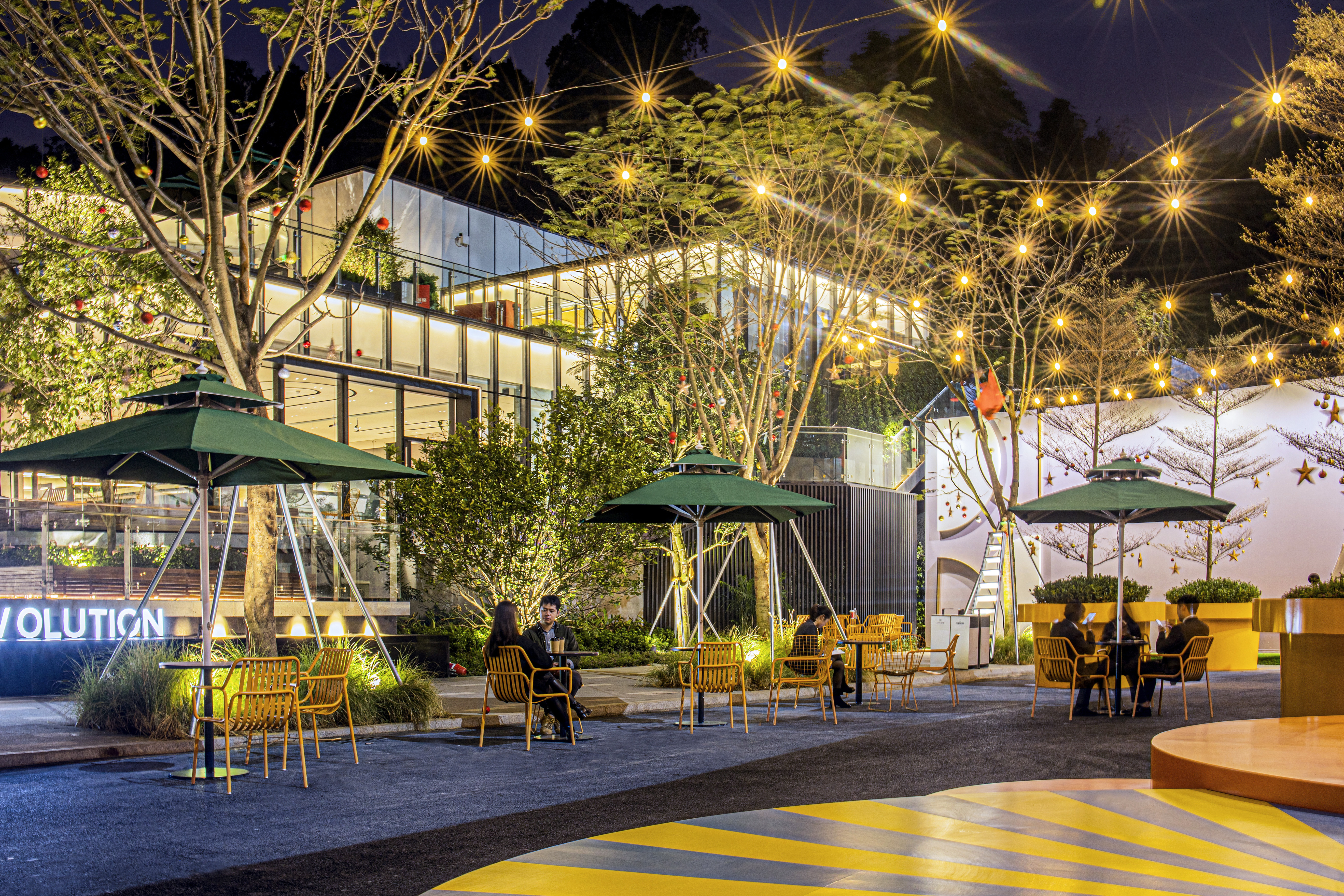
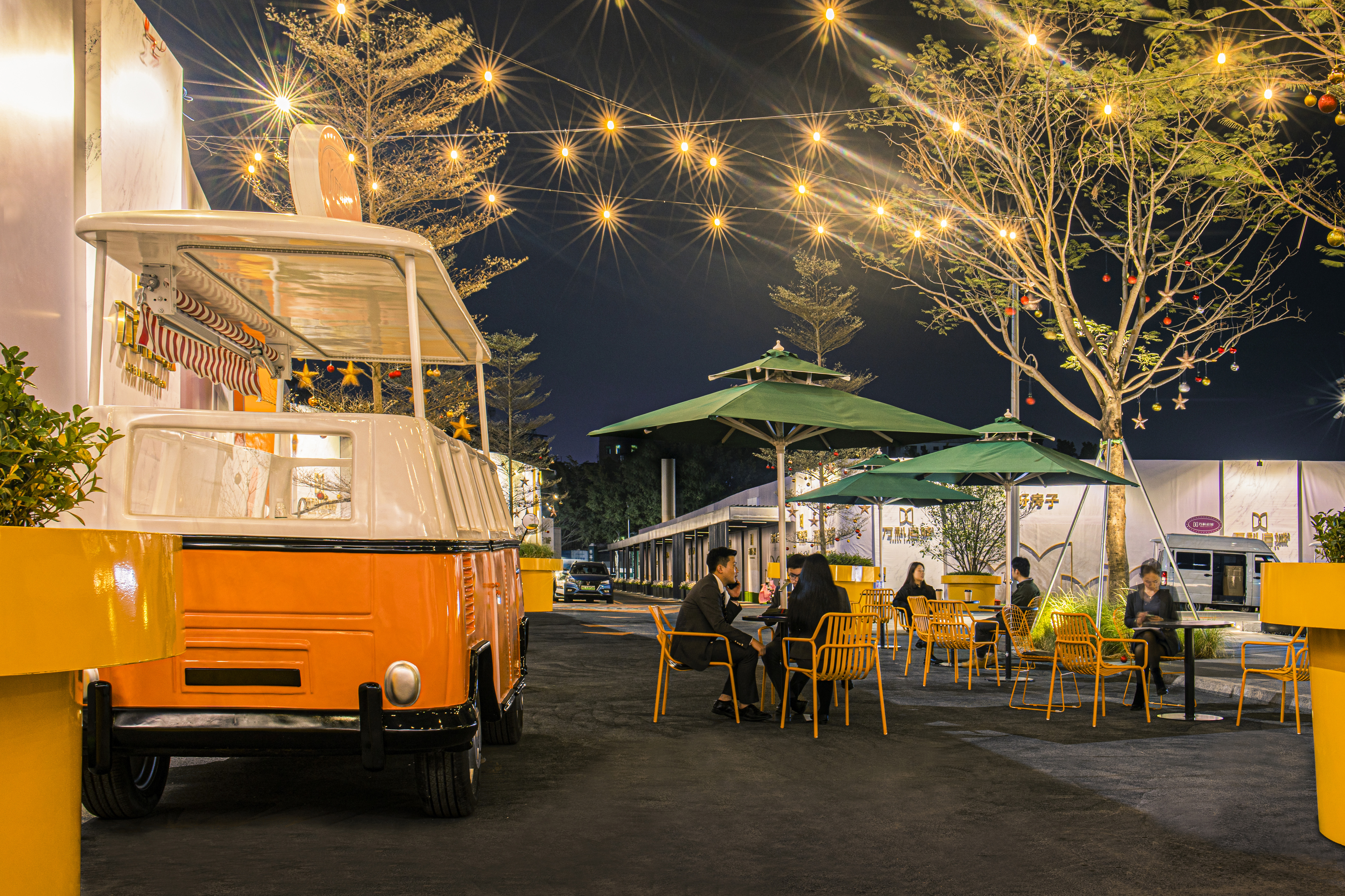
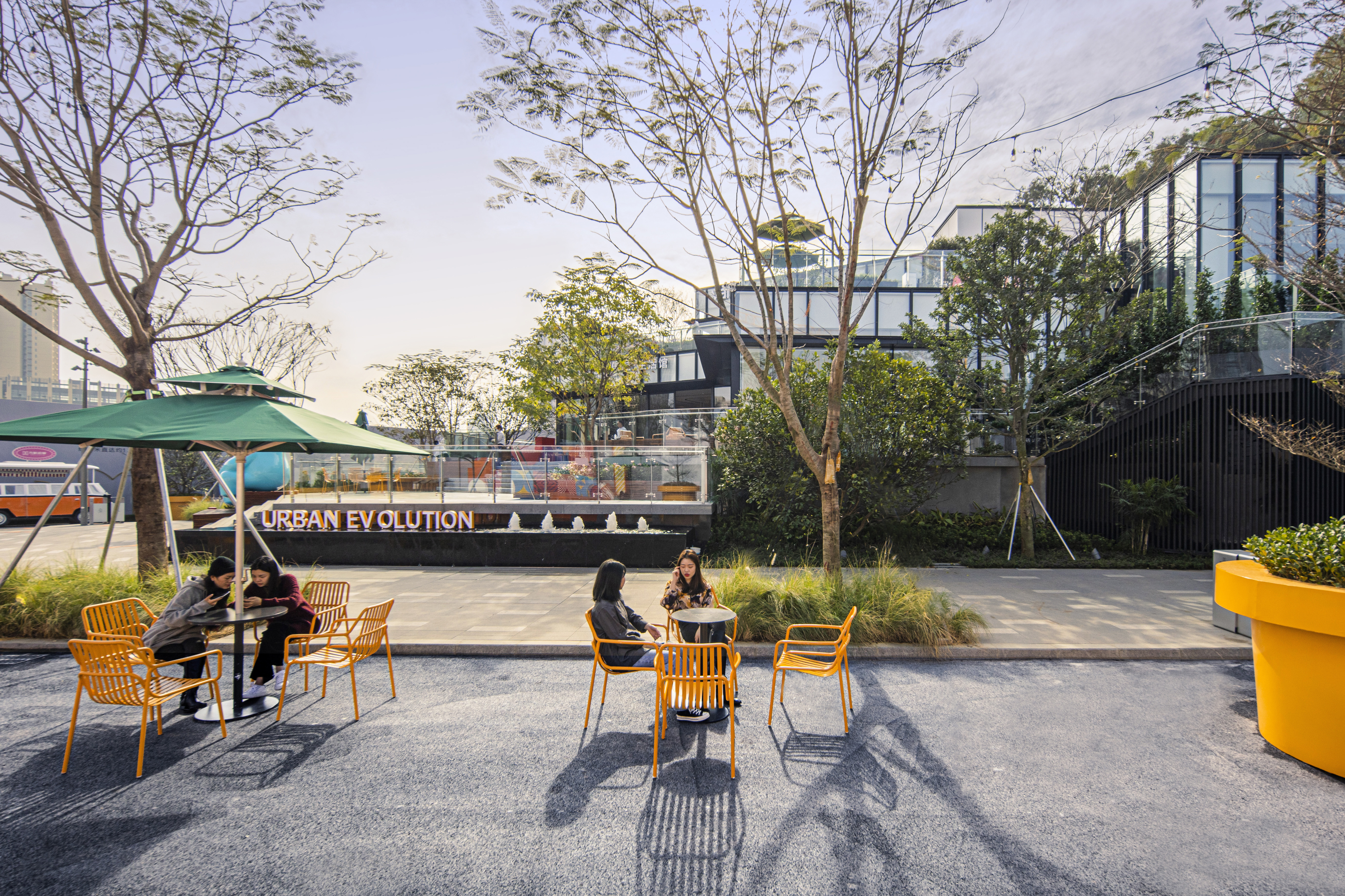
從街區到街角廣場,空間逐層遞進上升,景觀與建筑相互呼應與契合。
From the street to the corner square, the space rises layer by layer, and the landscape and architecture echo and fit each other.
▼社交化開放空間 | SOCIAL OPEN SPACE
生活場景一:穿過街區,踏上臺階,在這里可以舉辦派對、晚宴、展覽、露天電影、發布會等活動,通過混合功能業態與空間屬性,在這里營造更加親切的生活畫
面。觸發更多的社交可能,遇見真切的生活場景。
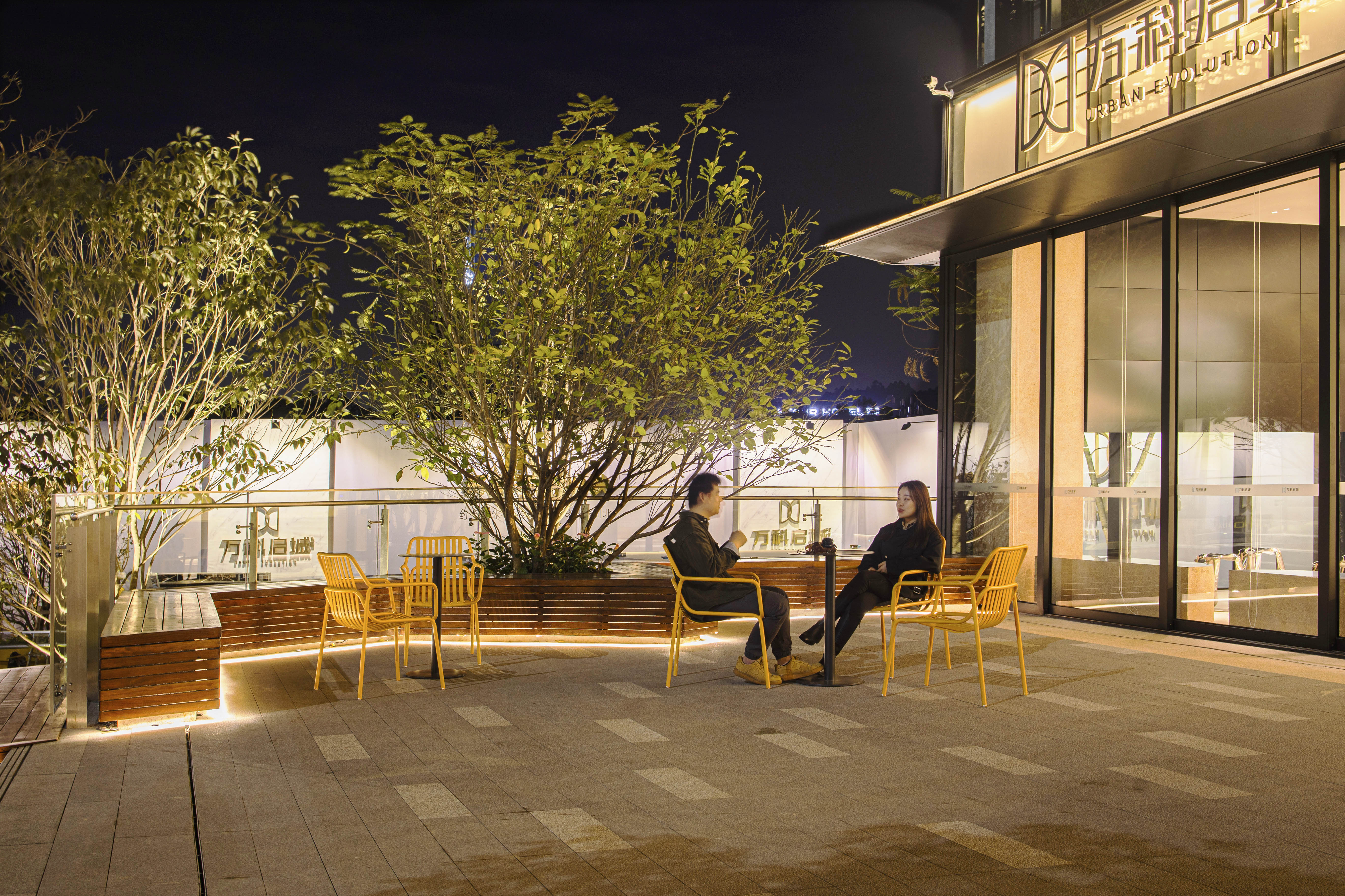
生活場景二:夜晚的燈光從建筑玻璃窗彌漫出來,露臺上的卡座變成了最為搶手的座位;現代人的情感交流往往需要場景溫度的加持,才能逐漸交融在一起;沒有
形式的堆疊,用最簡單的方式給予都市人一個理想的停留之地,真正地做到放松心情,感受生活。
▼廣場平臺 | Square Platform
展示中心入口廣場設計定義為公共廣場屬性,兼具室內餐飲業態的商業延伸空間。層層遞進、水平開展的廣場空間與建筑、室內視覺空間有效的銜接。
The design of the entrance square of the exhibition center is defined as a public square, which is a commercial extension space for indoor catering business. The square space
is effectively connected with the building and the indoor visual space by progressive and horizontal development.
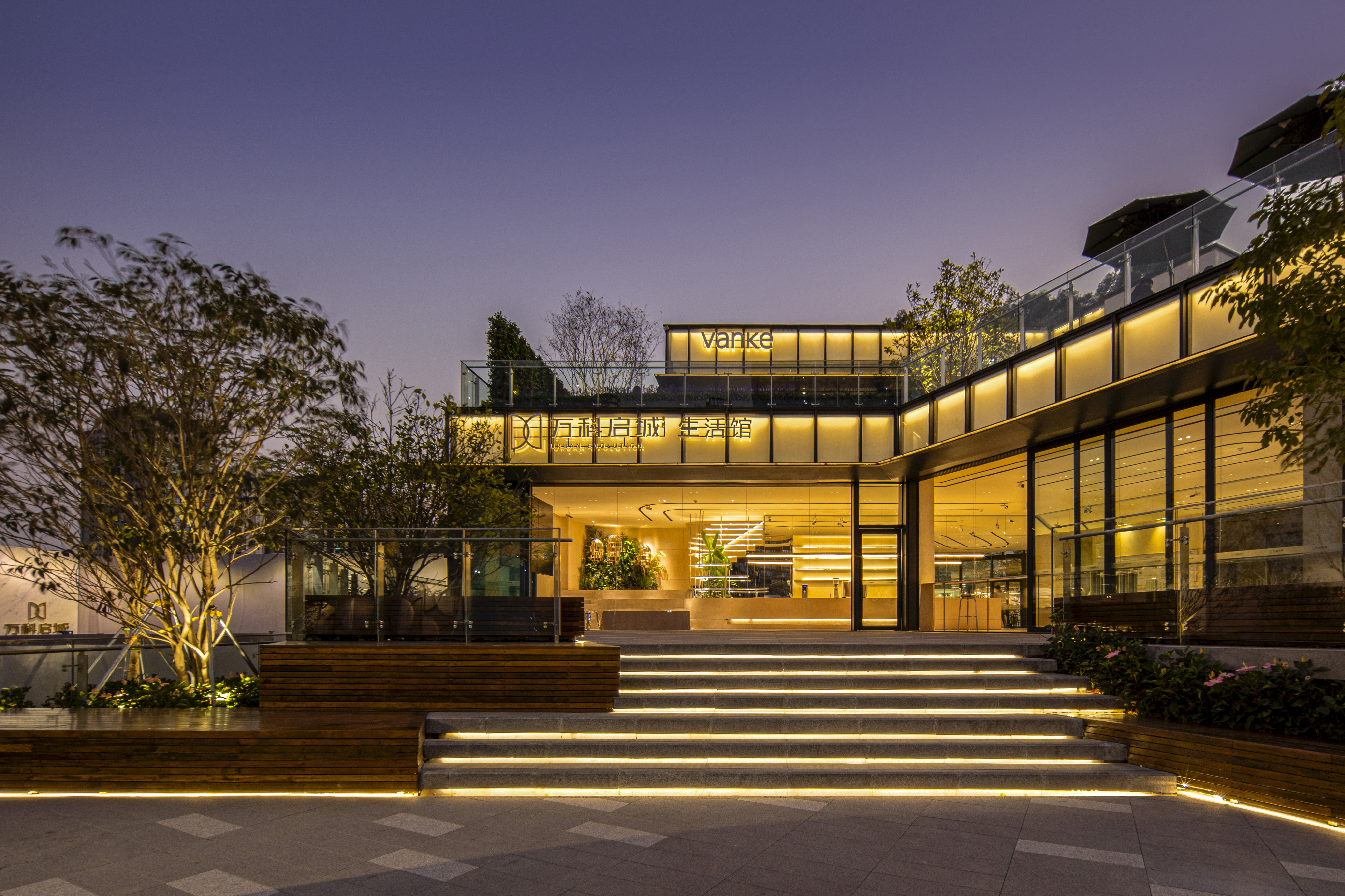
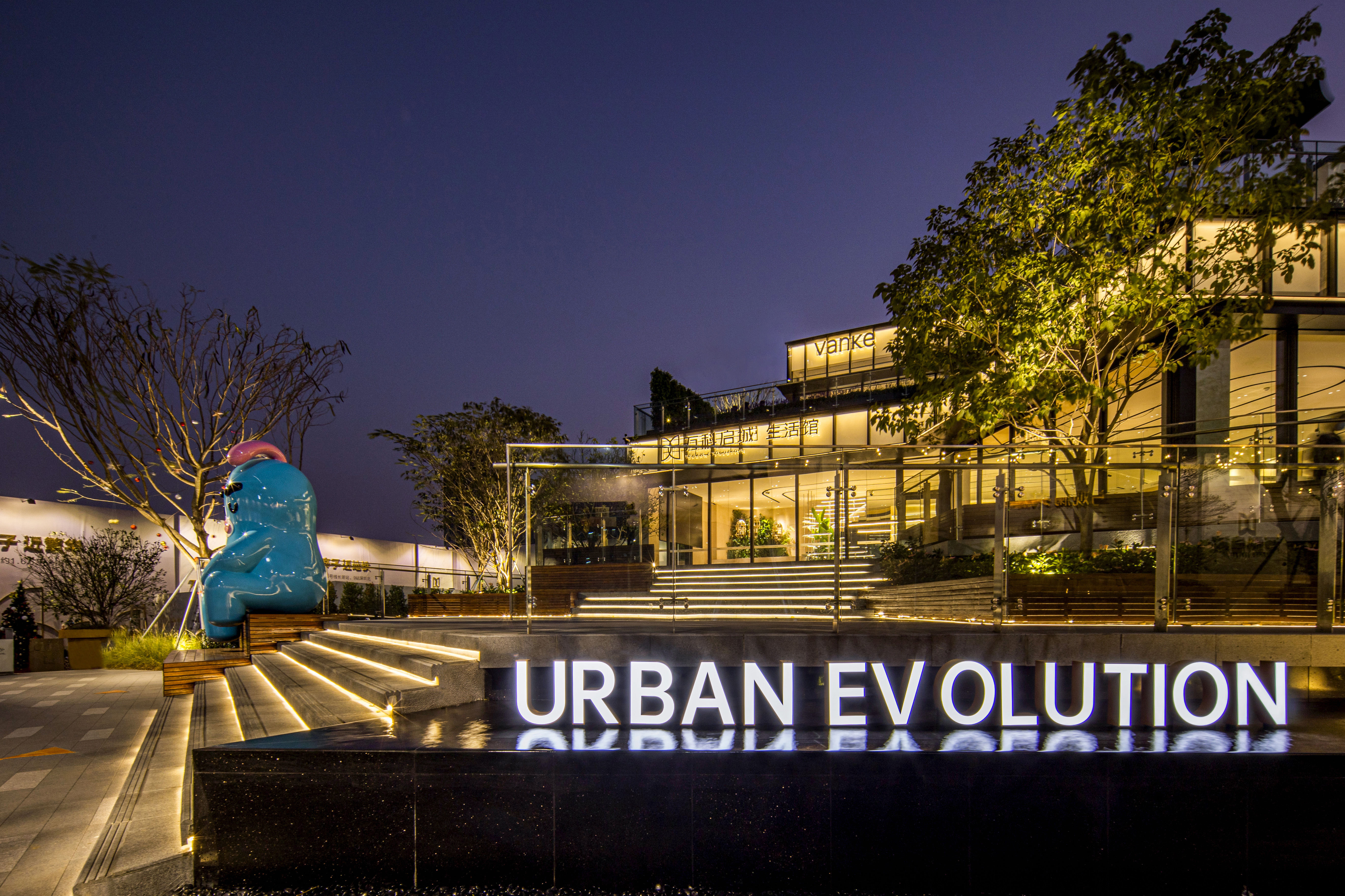
廣場上孤植的點景樹、 形象雕塑形成了場所的景觀點, 同時與場景功能產生聯系與互動。廣場側面的動態特色水景設計具有互動性,也是街景的點睛之筆。
The solitary landscape trees and image sculptures in the square form the landscape high-light point of the place, and at the same time have connection and interaction with
the function of the scene. The dynamic characteristic waterscape design on the side of the square is interactive, and it is also the finishing touch of the streetscape.
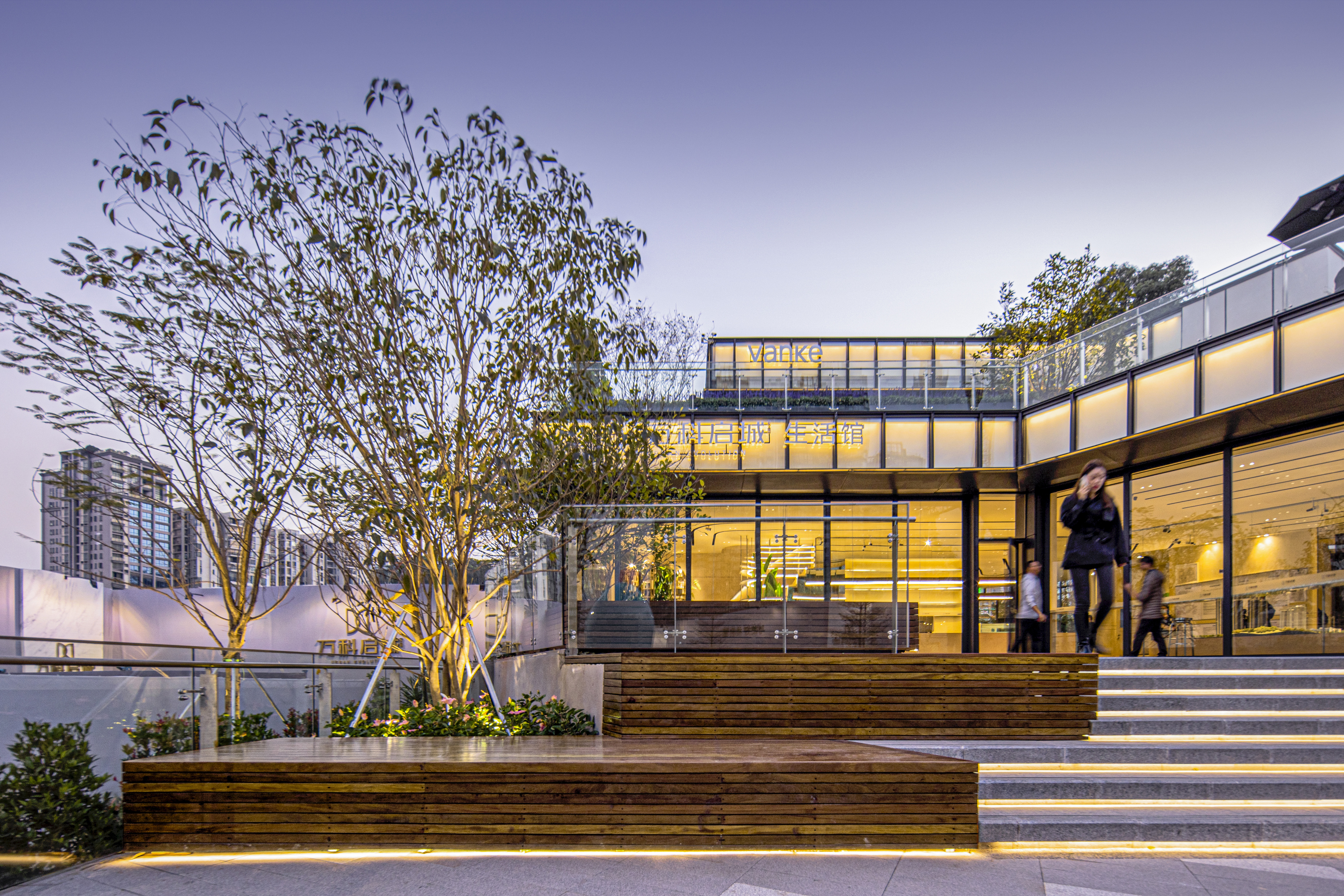
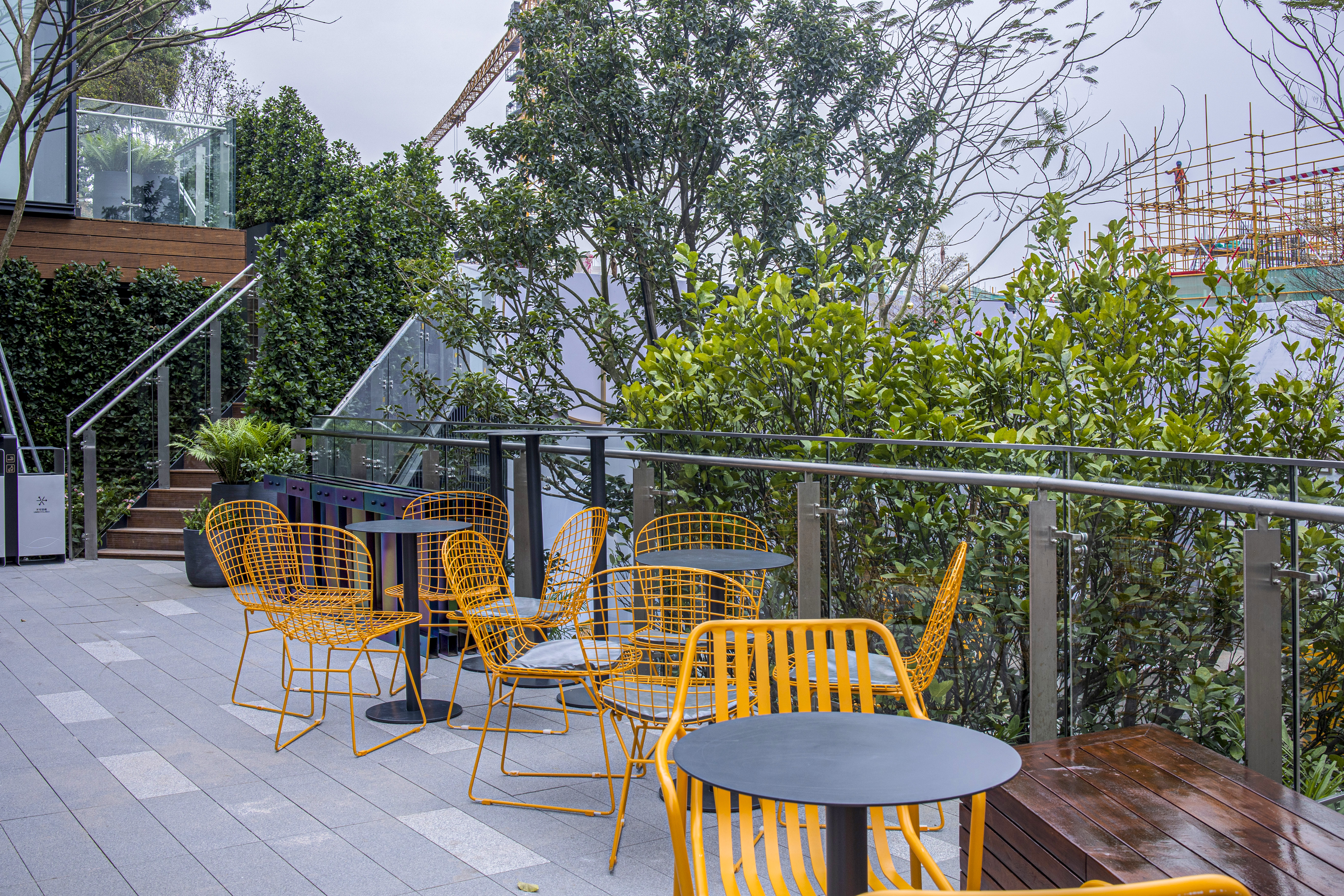
廣場以大塊面的平臺設計提供室外休憩、交流的場所,木質坐凳為開敞的室外空間提供溫暖、放松的調性,搭配軟裝家具,可以靈活轉換活動場景。
The platform design of the square with large surface provides a place for outdoor rest and communication. The wooden benches provide a warm and relaxing tone for the
open outdoor space. With movable furniture, the activity scene can be changed flexibly.
▼屋頂露臺 | Roof Terrace
二樓屋頂露臺進行局部空間圍合,可做室內休閑餐飲的外延。利用IP形象演變,使用在二層露臺、兒童游戲區外側平臺,在與地面場景相呼應同時,增強場所故事
線及記憶點。
The roof terrace on the second floor is partially enclosed, which can be the extension of indoor leisure catering. IP image is used in the balcony on the second floor and the
platform outside the children's play area. While echoing the scene on the ground, the story line and memory points of the place are enhanced.

▼趣味休閑 | Fun and Leisure
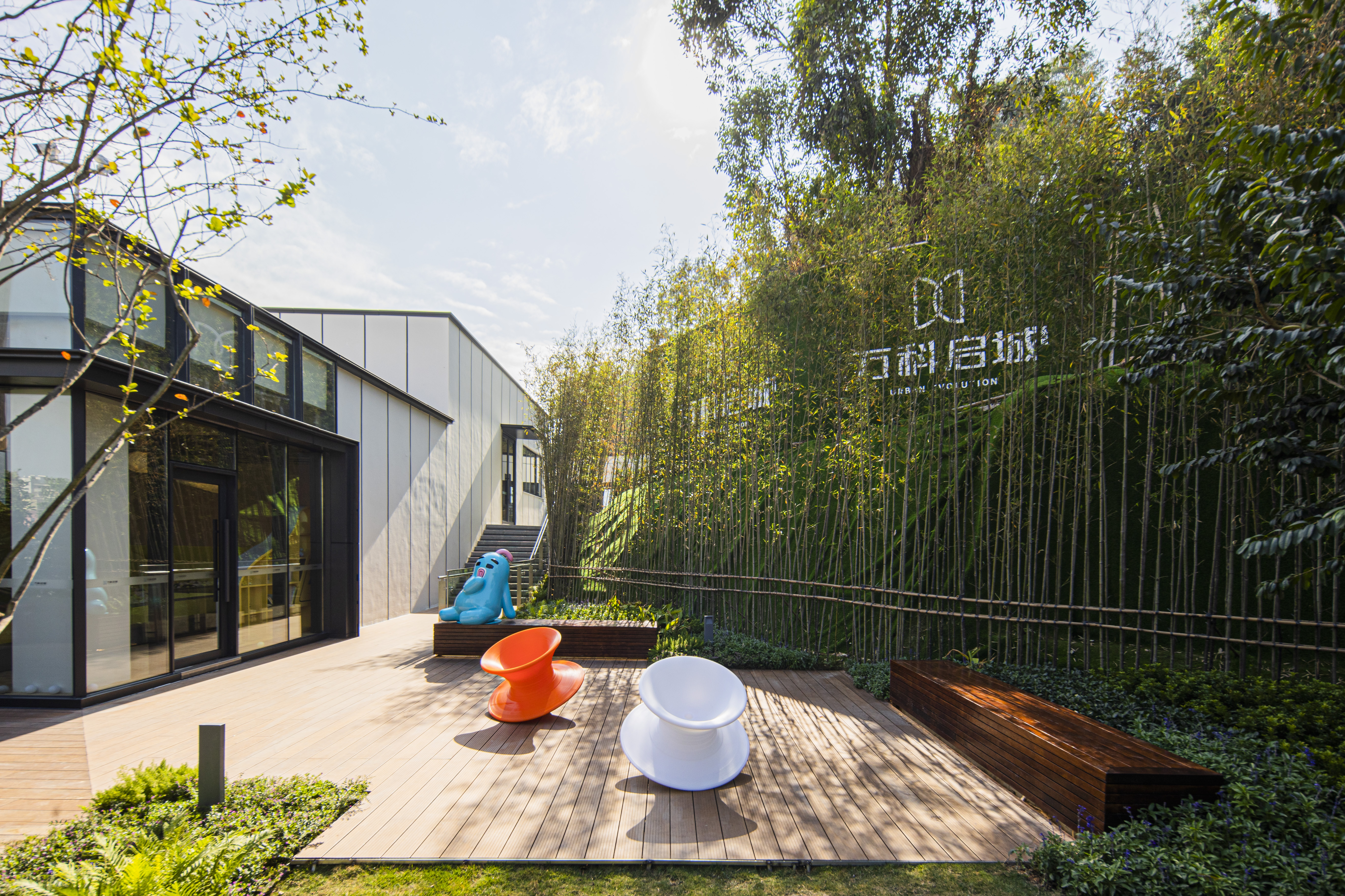
室內兒童游戲區外側也設置了小型戶外活動場所,配置了木質坐凳與旋轉椅,此活動平臺位于一層與二層室外參觀路徑的中間據點,是個小驚喜點,兼具趣味性和
休憩功能。
Outside the indoor children's play area, there is also a small outdoor activity place, equipped with wooden benches and rotating chairs. This activity platform is located in the
middle of the outdoor visit path on the first floor and the second floor, which is a small surprise point, with fun and rest function.
▼精致花園空間 | EXQUISITE GARDEN SPACE
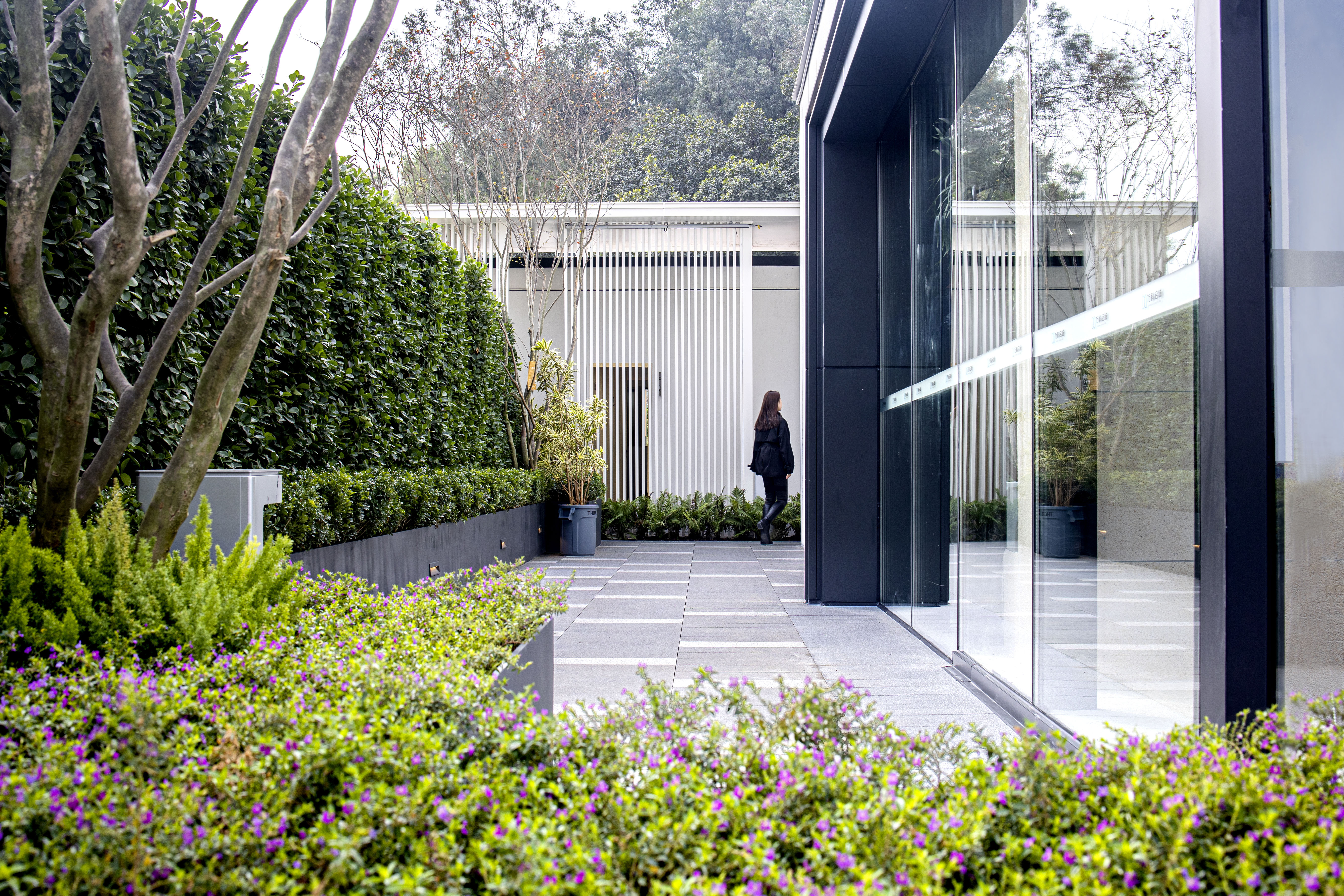
在繁華熱鬧的盡頭有一處安靜的庭院。被陽光照射的草坪,婆娑樹影投射的地面,序列而延展的格柵廊架。當環境與場地空間足夠純粹時,許多日常生活的片斷會
一一在眼前掠過,讓人們忘記了城市的喧囂,喚起熟悉親切的氣氛,產生內心的共鳴,講述場景的故事。偶爾,起伏的草坪上飄起陣陣煙霧,更增添這處小花園的
浪漫氣息。
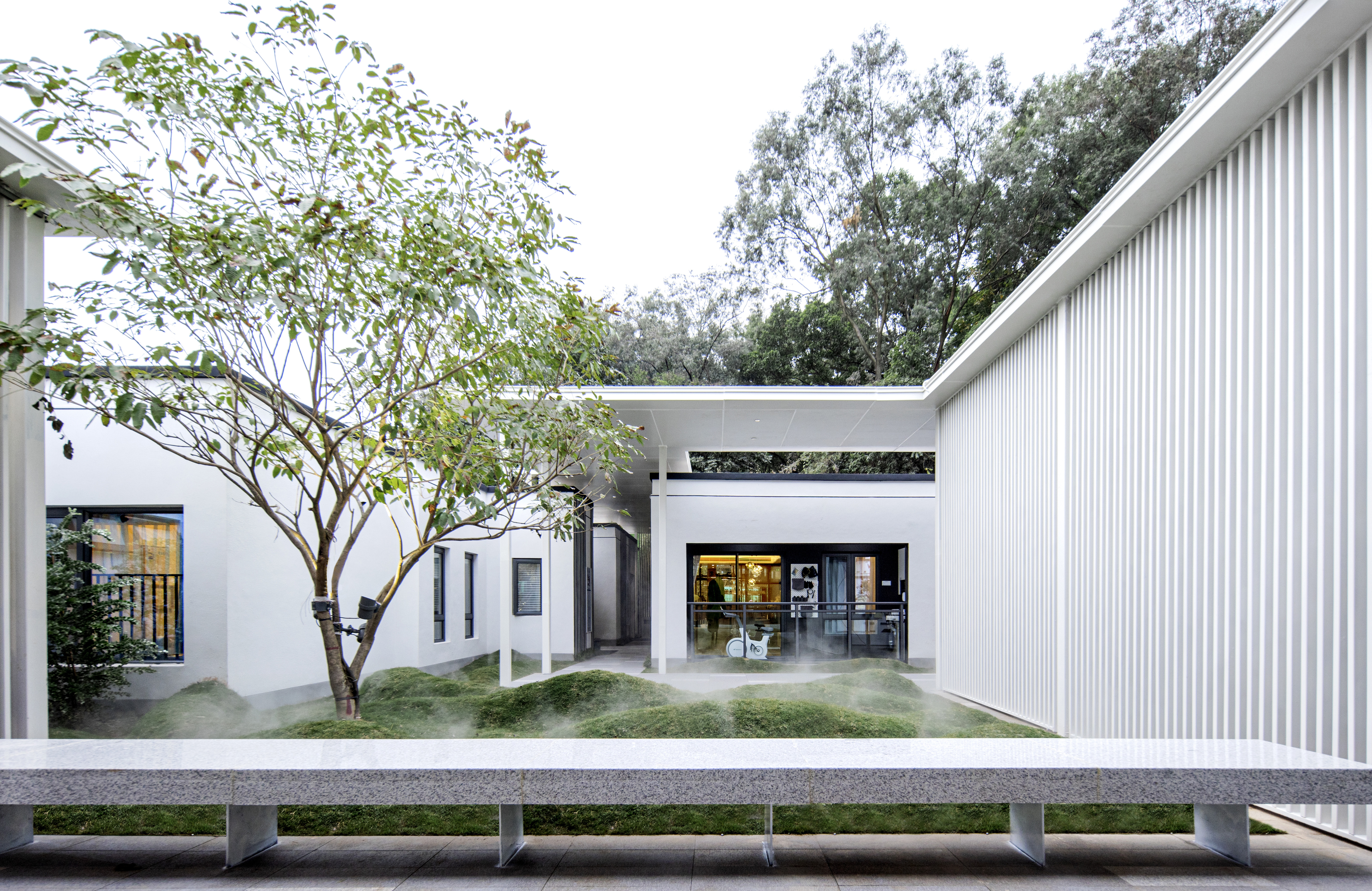
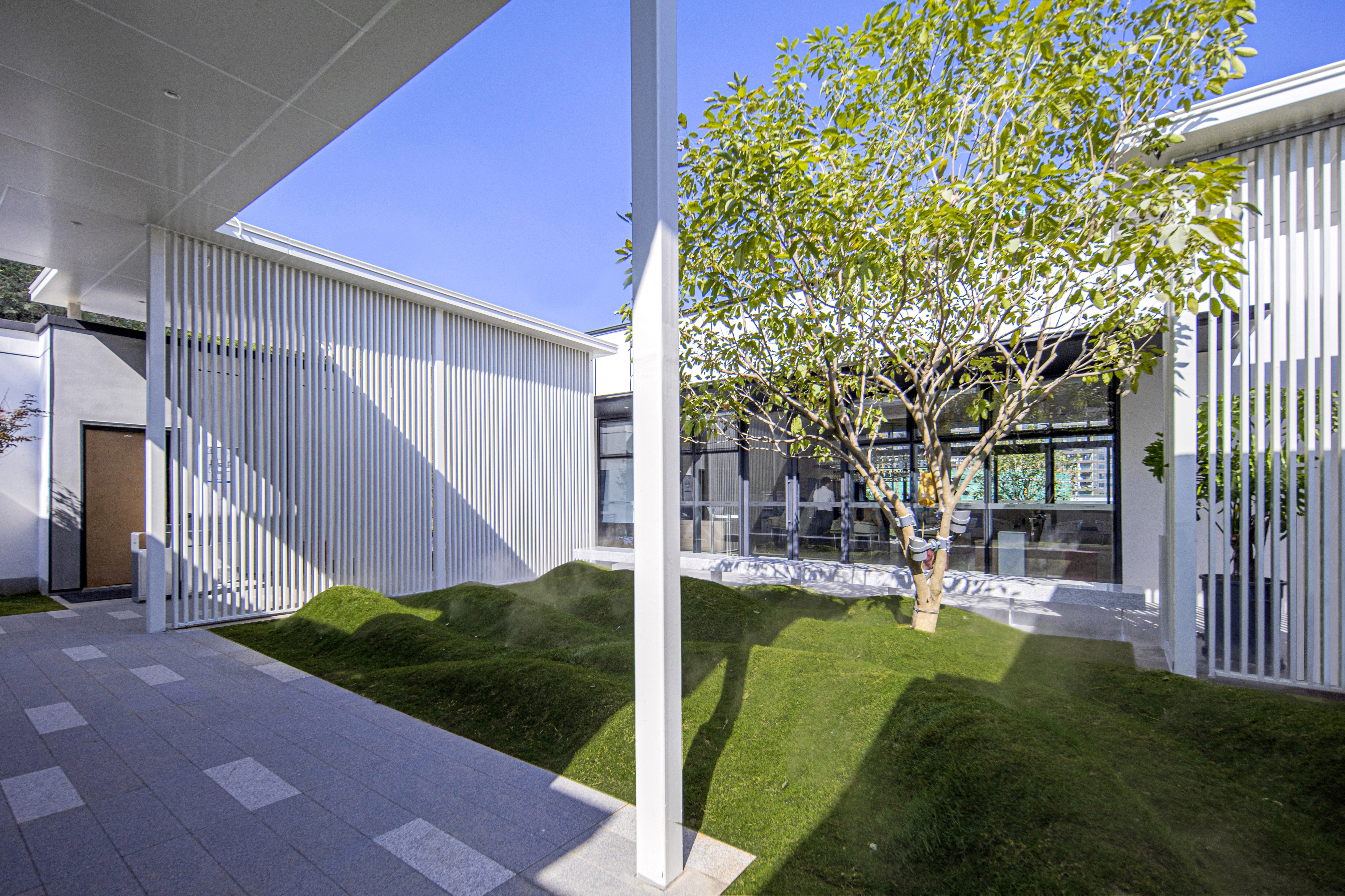
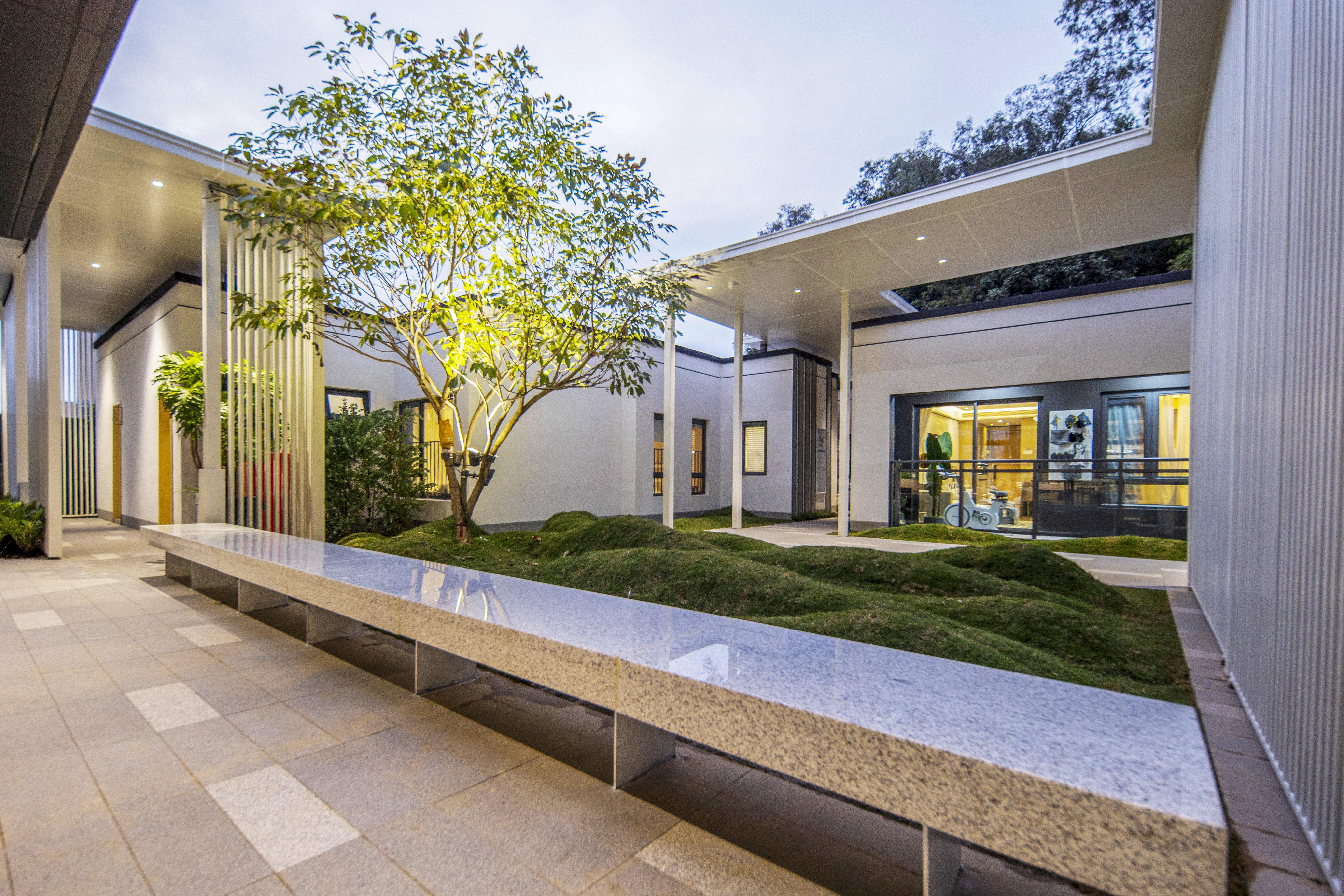
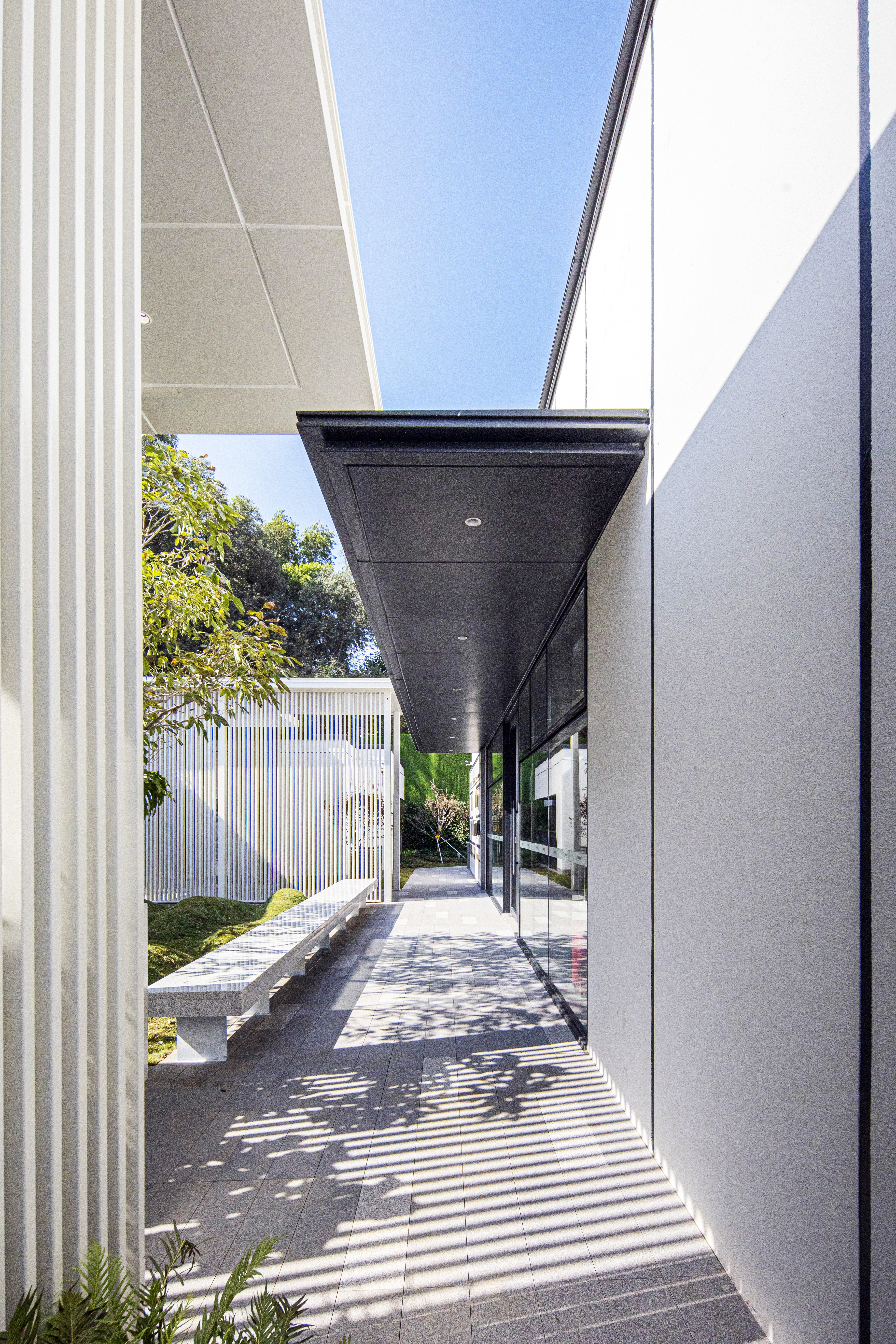

內庭院花園為參觀路徑的終點,在一系列歡愉、活躍的街道與廣場空間體驗之后,景觀設計想營造的是一處能停下來歇息的靜謐花園,從室內外觀賞皆能靜心欣賞的
精致庭院。
The inner courtyard garden is the end of the tour path. After a series of pleasant and active street and square space experiences, the landscape design wanted to create a quiet
garden that can stop and rest, and a delicate courtyard that can be appreciated from inside and outside.
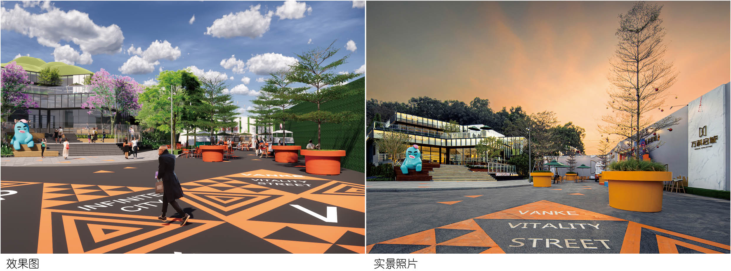
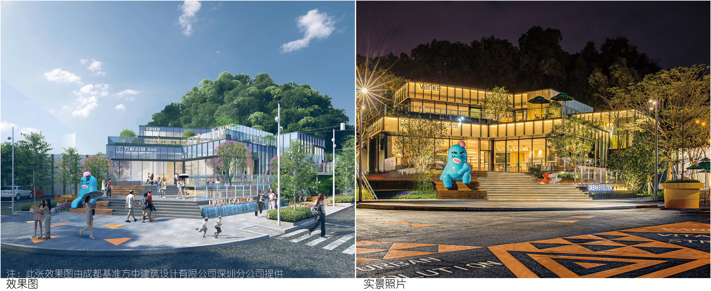
04.效果對比 | EFFECT COMPARISON
在各專業協調配合下,項目還原度接近100%,還原度極高。
With the coordination and cooperation of various professions, the project completion effect is very similar to design renderings.

05.細節打造 | DETAILS MAKING
細節是成敗的關鍵,在景觀設計中亦是如此。細節,是考量產品品質的重要標準。每一處細節,都表達了一個設計的責任與擔當。景觀細節表現的得當和巧妙無疑
能給項目加分。精心設計、精細施工,關注對細節的精工細作,營造出既人性化,又符合社會主流的高品質景觀項目。
Details are the key to success or failure of a project, and this is also true in landscape design. Details are an important criterion for considering product quality. Every detail
expresses the responsibility of a design. The proper and ingenious performance of the landscape details will undoubtedly add points to the project. Elaborate design, meti-
culous construction, attention to the details, to create a high-quality landscape project that is both humane and in line with the mainstream of society.
▼景觀與建筑交接 | Landscape Meets Architecture
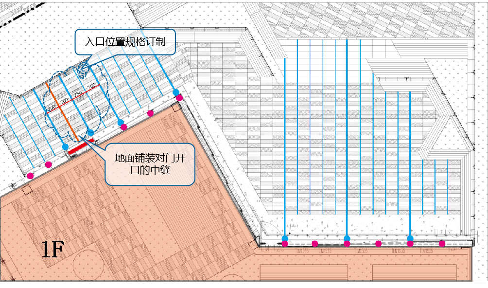
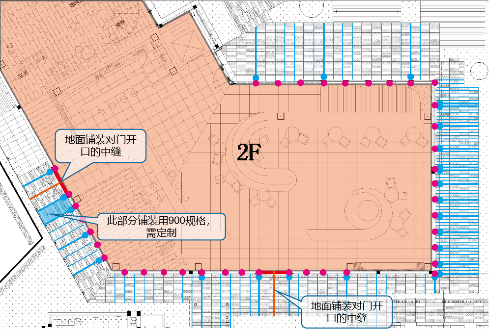
景觀鋪裝劃分,與幕墻對縫。部分石材規格訂制。
Divisions of landscape pavings are aligned with curtain wall. Some stone specifications are customized.
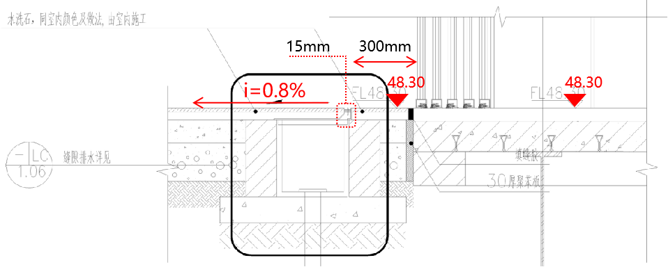
1樓平臺廣場鋪裝與建筑交接處設置與室內材料相同的300寬水洗石地面,使得景觀與室內過渡自然,加強室內外場景的貫穿。并設縫隙排水溝,避免門口積水。
At the junction of the platform plaza and the building on the 1st floor, the same 300-width water-washed stone ground is set with the same interior material, which makes
the landscape and interior transition natural and strengthens the penetration of indoor and outdoor scenes. And set up gap drainage ditch, avoid the door water.
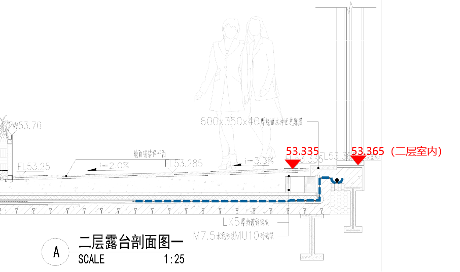
2層露臺建筑出入口位置下方設伸縮縫,景觀采取局部架空方式銜接變形縫高差,同時使室內外過度自然。
Expansion joints are set below the entrance and exit position of the 2F building. The landscape adopts partial overhead mode to connect the height difference of
deformation joints, and meanwhile makes the indoor and outdoor excessively natural.
▼景觀鋪裝對位做法策略 | Landscape Paving Counterpoint Approach Strategy
地面鋪裝與臺階交接處增加洗米石,避免石材直接交接,使得鋪裝與臺階過渡自然。
Add washing rice stone at the junction of ground pavement and steps to avoid direct transfer of stone and make the transition between pavement and steps natural.
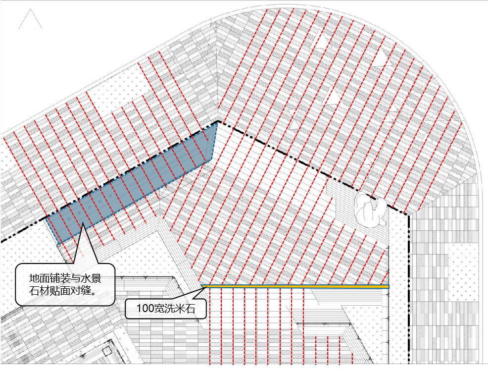
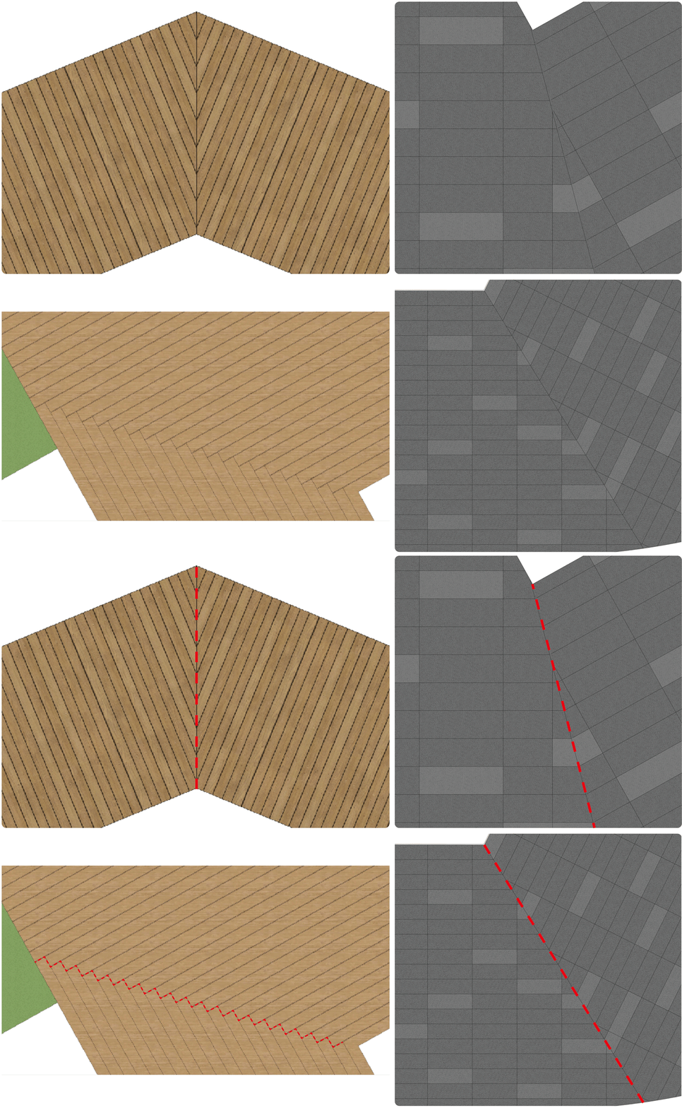
鋪裝與鋪裝交接處,經過精心計算,固定間距,定點定位嚴密對縫,清晰順直。
Junctions between pavings are made after careful calculation, fixed spacing, fixed point positioning tight on the seam, clear and straight.
06.植物配置策略 | PLANTING STRATEGY
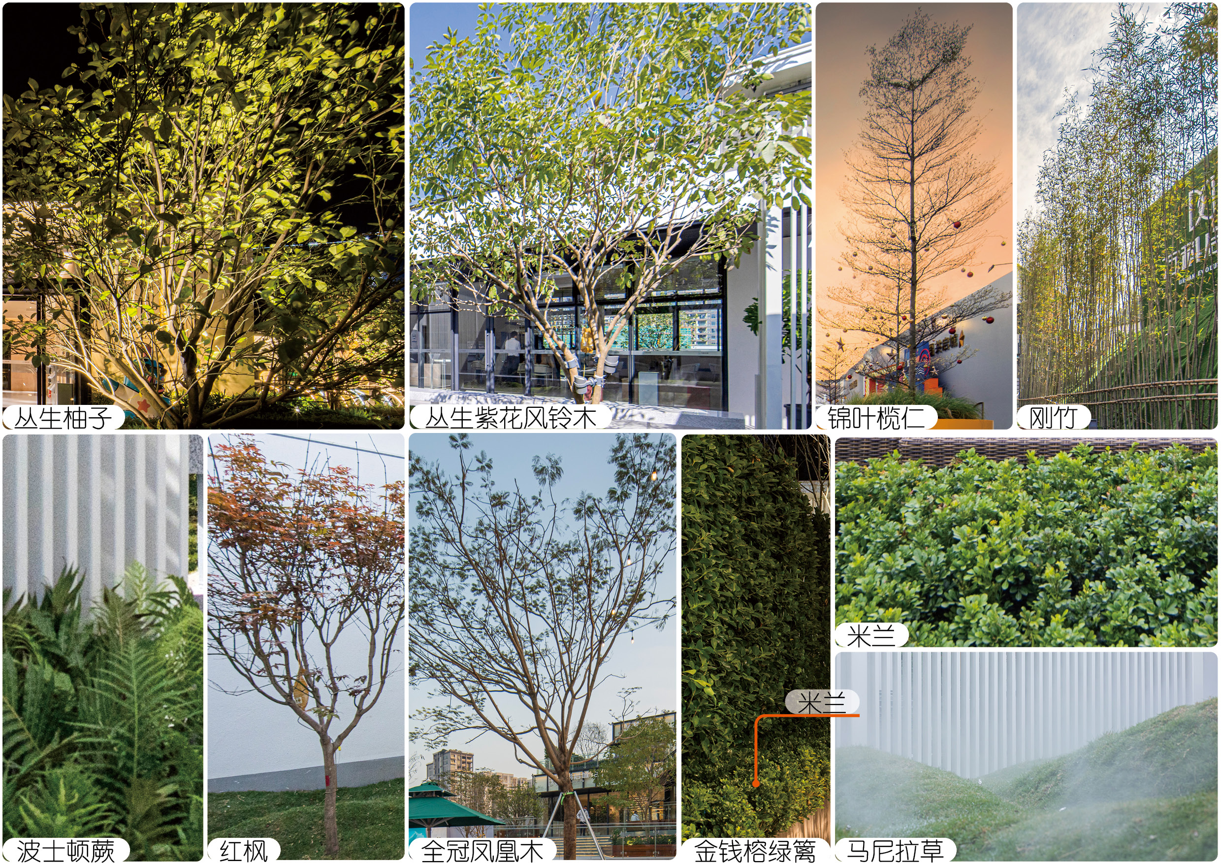
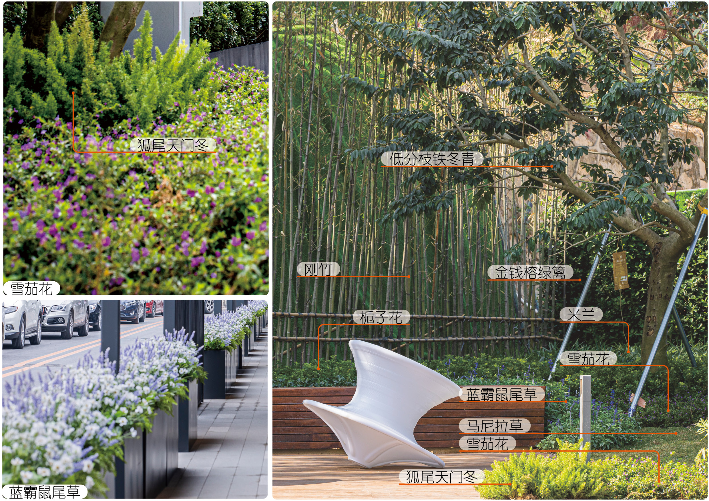
植物設計根據空間營造出不同的氛圍。
活力街區選用錦葉欖仁為背景植物。選擇挺拔的植物,配以色彩鮮明的種植樹箱,整齊的喬木及豐富飽滿的灌木搭配,形成色彩明快、韻律分明的街區景觀。社交
化開放空間以叢生喬木、特選造型喬木作為主景植物,使環境充滿生機和美感。選用的植物在大小、形態、色彩、質地等特征上,都各有變化。它們豐富多彩的效
果,為景觀增添了活力與色彩。提升空間的觀賞舒適性,增強景觀感染力,為人們營造一個放松身心的良好環境。
精致花園空間適當地進行種植地形處理,增加園林空間層次,豐富空間景觀特色,使植物景觀更富于內涵。
The plant design creates a different atmosphere according to the space.
Olive nut is selected as the background plant in the vitality block. Choose tall and straight plants, with bright color planting boxes, neat trees and rich and full shrubs, to form
a bright color, rhythm distinct street landscape.The socialized open space uses clustered trees and specially selected shaped trees as the main plants, which makes the enviro-
nment full of vitality and beauty. The selected plants vary in size, shape, color, texture and other characteristics. Their colorful effects add vitality and color to the landscape. E
nhance the viewing comfort of the space, enhance the appeal of the landscape, and create a good environment for people to relax.
The delicate garden space is properly treated with planting terrain, which increases the garden space level, enriches the space landscape features and makes the plan-ting de-
sign more rich in connotation.
07.室內一覽 | INTERIOR OVERVIEW
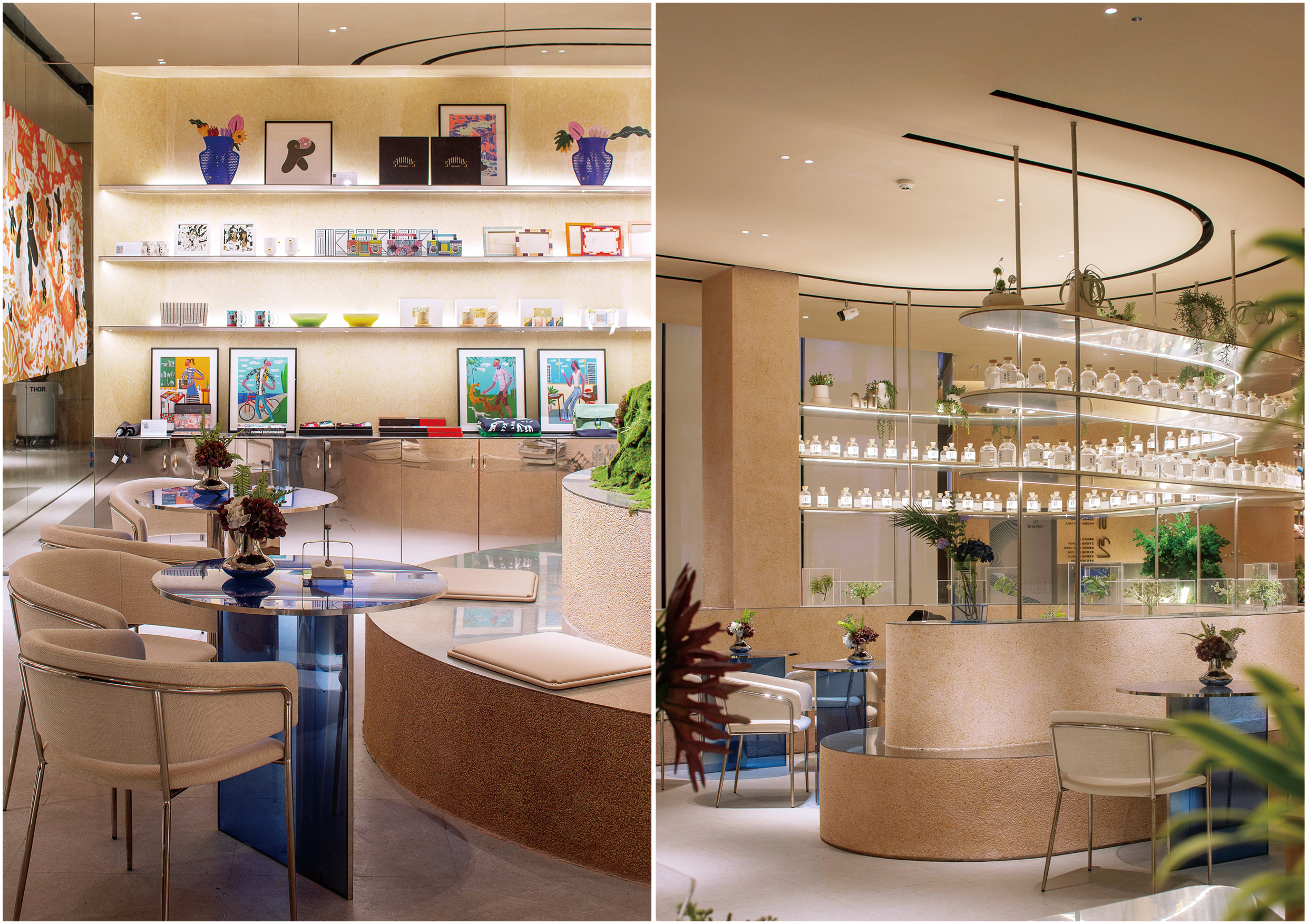
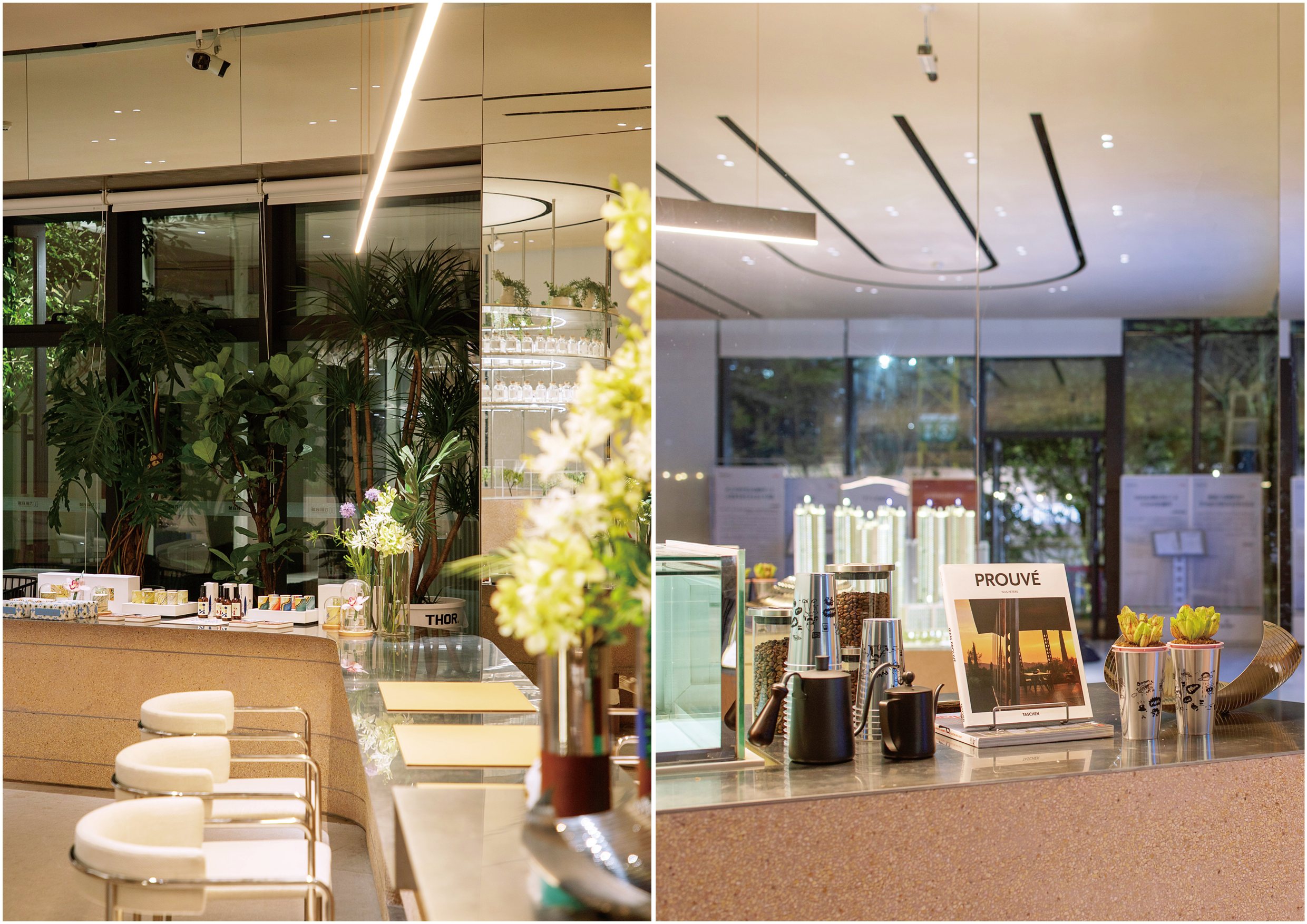
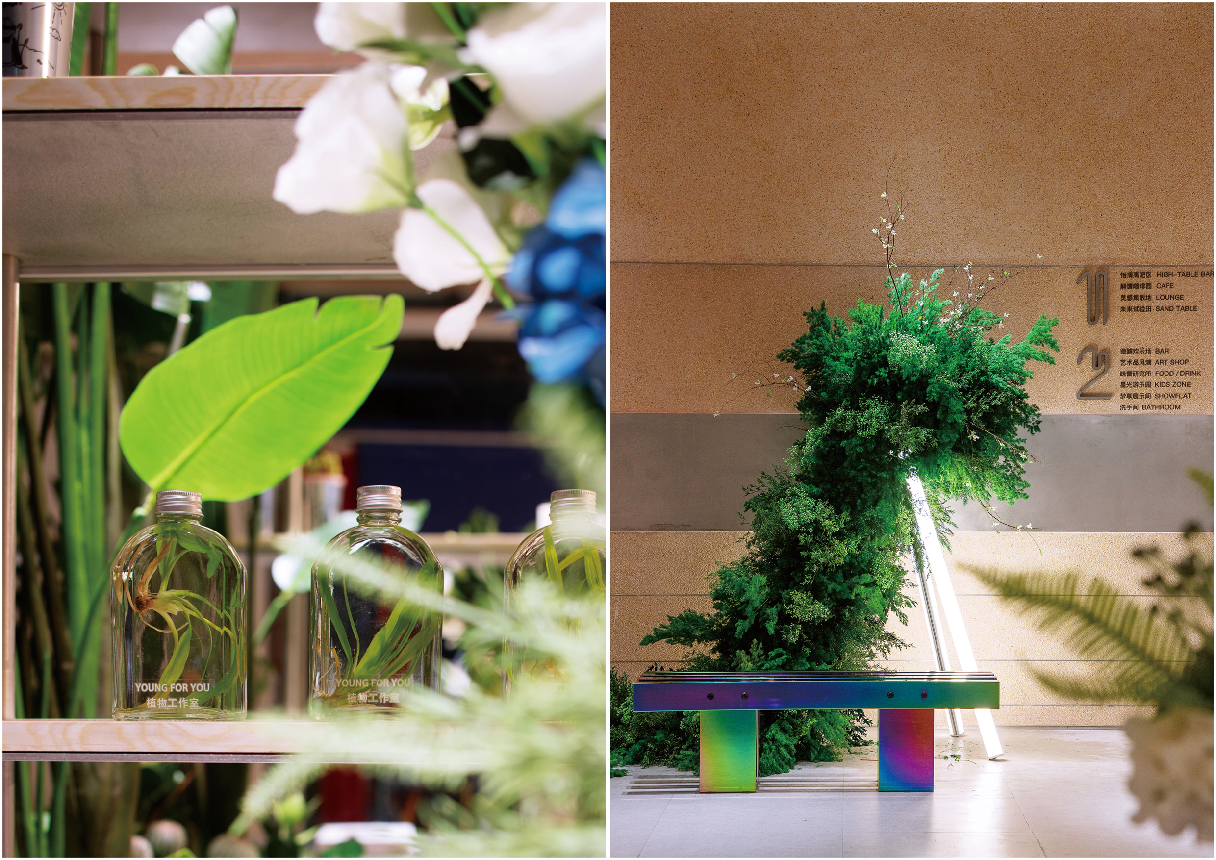
景觀設計著重對于建筑、室內空間屬性的理解,加強室內外場景的貫穿和互動,增加了視覺焦點同時,也有效延續和補充室內功能場所。
The landscape design focuses on the understanding of the attributes of architecture and indoor space, strengthens the penetration and interaction of indoor and outdoor
scenes, increases the visual focus, and at the same time, effectively extends and complements the indoor function places.
注:室內照片由室內設計提供
08.設計師說 | DESIGNER STATEMENT
開放活躍的街區布局,精致流暢的體驗動線,萬科啟城展示區的景觀設計讓人體驗室內外空間與功能可以相融合互通,小尺度、低沉本的展示區,需要景觀設計與
建筑、室內完美緊密契合。在這里景觀與建筑沒有邊界,交流的行為沒有邊界,公共空間正從“功能主義”向“人本主義”轉變。讓人走出自己“小家”,走入公
共建筑空間,進入了一個意義更廣泛的“大家”。由此展示區設計可窺見未來社區的美好場景,令人心生向往,與生活無界鏈接,共享城市精彩。
The open and active block layout, exquisite and smooth experience of the visit route, the landscape design of Urban Evolution exhibition area allows people to experience the
integration of indoor and outdoor space and function, as well as the close combination of landscape design and architecture. There is no boundary between landscape and
architecture, no boundary between communication behavior, and the public space is changing from "functionalism" to "humanism". Let people out of their "small home", into
the public architectural space, into a wider meaning of "big home". Therefore, the design of the exhibition area can glimpse the beautiful scene of the future community and
make people yearn for it. It links with life unbounded and shares the splendor of the city.
-THE END-
-----------------------------------------------------------------------
項目名稱:深圳萬科長湖頭啟城示范區
委托業主:深圳萬科
業主管理團隊:胡爽、紀惠敏、張謝鑫、陳楠、周浩舟、周露曦
景觀設計:創浦景觀設計(上海)有限公司
景觀設計團隊:肖琳、李芳瑜、韓治鳳、伊璟諾、葛則鳳、陳智超
景觀施工圖:深圳本末度景觀設計有限公司
建筑設計:成都基準方中建筑設計有限公司深圳分公司
室內設計:dongqi 棟棲設計
室內軟裝設計:WED中熙設計
攝影師:王婷
項目地點:深圳長湖頭
設計面積:4300㎡
設計時間:2020年7月
完成時間:2020年12月
Project name: Vanke Shenzhen Changhutou Demonstration Zone
Entrusted Owner: Shenzhen Vanke
Client Management Team: Hu Shuang, Ji Huimin, Zhang Xiexin, Chen Nan, Zhou Haozhou, Zhou Luxi
Landscape Design: T.Workshop
Landscape Design Team: Xiao Lin, Li Fangyu, Han Zhifeng,Yi Jingnuo, Ge Zefeng
Landscape construction drawing: shenzhen benmodu landscape design co., LTD
Architectural Design: Chengdu Benchmark Fangzhong Architectural Design Co., Ltd., Shenzhen Branch
Interior design: Dongqi building design
Soft decoration design: Wed Zhongxi design
Photographer: Wang Ting
Project location: Shenzhen
Design area: 4300 square meters
Design Date: July 2020
Date of completion: December 2020
金獎
第四屆AHLA亞洲人居景觀獎金獎-漕河涇印象城
優秀獎
第四屆AHLA亞洲人居景觀獎優秀獎-寧波三官堂TOD商業(螢集·繽虹里)
哈斯鱷梨
解熱、鎮痛:能夠通過發汗而降低體溫
哈斯鱷梨
解熱、鎮痛:能夠通過發汗而降低體溫
哈斯鱷梨
解熱、鎮痛:能夠通過發汗而降低體溫
哈斯鱷梨
解熱、鎮痛:能夠通過發汗而降低體溫
金獎
第四屆AHLA亞洲人居景觀獎金獎-漕河涇印象城
優秀獎
第四屆AHLA亞洲人居景觀獎優秀獎-寧波三官堂TOD商業(螢集·繽虹里)
卓越獎
SRC街景設計獎商業類街景卓越獎-漕河涇印象城商辦綜合體景觀
年度最佳商業景觀銀獎
ELA2021年度最佳商業景觀銀獎-萬科臺州十里觀邸商業及城市公園
杰出設計獎
第十屆艾景獎園林景觀規劃設計大賽杰出設計獎-寧波萬科海上都會項目
年度杰出景觀規劃師
第八屆艾景獎國際園林景觀規劃設計大會年度杰出景觀規劃師
榮譽證書
2021年度南京市園林工程“金陵杯”(市優質工程)獎-焦點科技大廈(一期)園林景觀及道路工程
會員單位
SRC街景研究中心會員單位
<li id="oegmc"></li>